Showing posts with label mockup. Show all posts

Friday, May 2, 2014

Appmaker User Interface - Mockups


This week I've been spending a bunch of time with the Appmaker team at the Mozilla all hands work week.  One thing, that 's really hard for me to do - is to work on products that don't seem to make visual sense to me - and that's kind of what was happening when I looked at the design canvas of Appmaker. Here is what the user interface currently looks like: 


What's working?

- The building components are super easy to identify and manipulate. 
- The searchability of components
- The ease with which you can sign in or add a new app

What could use some work? 

- The design canvas itself was bit confining. I felt like I was in a claustrophobic room when I designed
- It feels like theres a lot that I have to pay attention to in one glance and I can't figure out where I am supposed to be looking, clicking, thinking at any given moment. 
- It still feels like a lo-fi prototype - so users can't really see the friggin' awesome potential for this tool.

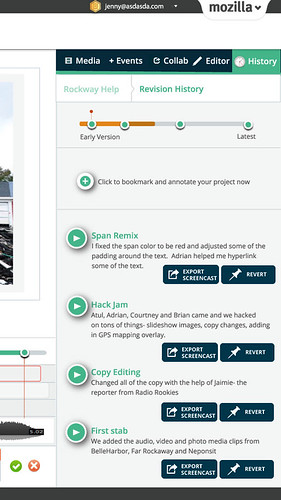
Mockup Attempt One: The Webmaker Appmaker

For the first iteration of mocking up the UI, I took cues from Webmaker. My thinking here is that we could be delivering a consistent, cohesive product family offering. 


Since designing the UI mockup sometimes inspires me to rethink the tool, I added a few notable features here: 

1. Media Library - the ability to use the mobile devices affordances to pull in assets to integrate into the app design 

2. History - the ability to save your process, and revert to any moment in your designing 


Mockup Attempt Two:


I took a bit of a different approach here. I thought through how I actually organize my space as a designer, and how that approach could be reflected in the design. When I design, I like to organize my space and shift things around the canvas as I am working on different components. Some fun things to note here: 

- the phone itself is clickable so that you can change the model (the firefox phone is seen here).
- the toggle on the top of the canvas allows you to switch back and forth from different design modes: editor or preview
- the floating editor changes depending on what component you are working on. 
- undo, redo.

That's all for now. Just taking the time to think through the designs and will probably user test with the Appmaker team to really figure out what's a good direction. 


Monday, April 8, 2013

Protyping Peer Assessment for Webmaker

For quite some time now we have been talking about the idea of integrating some form of peer assessment and feedback into Webmaker, as a way to level up an individual user's craft and community.  Today I want to share some ideas that Chloe Varelidi and I have been tinkering with and starting to actually prototype with Atul Varma.  I am going to do a little walkthrough of a potential user experience. Keep in mind that some of this is probably wrong, but I want to put it out there so that we can work on polishing those bits.
Imagine that you came to Webmaker and you were looking for a way to learn or gain specific skills. You click on the "Skills" tab (I'm sure there are tons of other names that could be more appropriate for this navigation item). On the skills page you see all of the possible badges that you can apply for - and these badges in the future will not just be individual small badges, but represent larger learning pathways. 


If a user clicks on a badge - they will learn about the badge through a playful interactive displayer and have the ability to immediately apply to earn that badge. 


When the user clicks "Apply" they are given the apply interface. This reminds the user what the criteria is for the badge, gives them the ability to upload evidence and write reflective thoughts on their process.  There are several things that we could do here, one idea was to have the user create a "how to" showing how they made their project, which eventually could be integrated into some kind of maker gallery.  What's great about this approach to "badge pledge" is that it is a useful  interaction in its own regard, and not existing solely for assessment/recognition purposes - that way there's both extrinsic and intrinsic incentives involved.


The user then submits their badge application. There are several directions that we could go from here. One option is to have all of the entries go into a queue that is accessible for mentor reviews from a secure interface that they will be able to access by logging into the queue through a mentor username and password to the site.
Another option might be to completely make this public and leverage a service like twitter. I imagine that the interaction here (after a user signs in and then clicks submit) could be similar the Army of Awesome (see below) where a the applications compile in a tweet queue and then peers pick up the individual applications to review. If we went in this direction, some more sophisticated flow will need to be developed so that there is a way to in essence vet the quality of peer review.


The actual application review for a mentor might be something like this:


Here, the reviewer can see the badge applicant's evidence and reflection and then provide feedback as well as recommend the user for a badge. One of the ideas that we had for this particular touchpoint is to create a feedback widget that encouraged constructive feedback. Taking a cue from the Lifelong Kindergarten Lab Chloe actually helped us to work on our internal tools for feedback at Mozilla meetings. Since we are often typing on etherpads during calls, we organize our feedback into categories. We added the blue one to the model to encourage collaborative making.
  • Green (what's awesome)
  • Yellow (what I am unsure about)
  • Red (what's not working)
  • Blue (an idea that I have)
Here is a screenshot of one that we recently did:


Since this has been a successful prototype for us internally, we thought that we could take this concept to a feedback widget. We were thinking of something like disqus that could be modified by different users to suit their own needs and own kinds of evaluations (imagine evaluating using just emoji's ?!!!)  The idea is that a mentor is able to click on the different colors and then is given prompts to help them to construct their feedback. In this moment they are able to recommend the badge as well. There are individual rubrics that we could create for the individual assessments as well, which is not shown.  Here is the sketch for this general idea: 


After this, let's imagine that the user was recommended for a badge. They are then sent a link (via twitter, via their Webmaker account -- depending on what direction we take above) that would look something like this:


What is worth noting here is that we include options for the user to send thanks or to rebound the feedback. This sets us up for beginning a dialog as well as using this touchpoint to evaluate the evaluator. This is a crucial step to the user flow, since it helps mentors improve their feedback, which is a skill in and of itself. There is some work that still needs to be figured out here in terms of what the interaction is if a user is not given the badge. We want that to be a positive experience. 

Chloe made this great stop motion video to quickly go over the overall interaction that I described:


Wondering what the next steps are here? Well, I am happy to tell you:

1. Prototype: We are going to use the Chicago Summer of Learning work to prototype a version of some of this interaction and then iterate on that to develop some of this flow out for Webmaker.

2. Identify mentors: we need to identify how mentors are going to play into this work flow for the Summer campaign. I know that we are going to have an active, dedicated community, however the decisions that we make around their involvement will impact some of the choices that we make moving forward with the assessment interaction design.

3. Work with the Webmaker, Mentor and Badges teams to make sure that we are all collaborating on this work.

Tuesday, January 22, 2013

Make - First Interaction Design

 On the Webmaker community call and on his blog this week, Brett Gaylor presented that we are currently aiming to solve several key design questions for Webmaker. You can read about the challenges and solutions here.

In an effort to move Webmaker into a space where from the moment you come to the site - you are encouraged to make something (what Brett is calling "make - first" interaction design) , I am going to show some prototypes that I have been working on. 

You can see all of them here in larger, more legible form.

Even though the fidelity of my prototypes might seem more polished then usual, as always please note that these are mockups and prototypes designed for the purpose of iteration, so please give me feedback and ideas for things that I should consider when moving forward with the design. 

landingpage-wire-annotated

First, lets take a look at the Landing page. The idea here is that from the moment that you land on Webmaker.org you are given the call to action to tinker and interact with content in a very real way. What you are looking at is actually a meta "Animated webpage" project that is comprised of several types of projects - so in essence the content type becomes a gallery. The page is instantly hackable and as the user, starts tinkering with an x-ray goggle like interaction- they can choose to deep dive and reveal the more advanced editing tools. While this is a mockup for the landing page - you could imagine that it is also a prototype for how a user might be able to pull and view content from the gallery - so the user gets the opportunity to digest a project first as consumable content and then engage with it as a hackable medium. This kind of interaction was deeply inspired by my reading of the work of Mimi Ito - particularly in her book Hanging Out, Messing Around and Geeking Out. Here is what it might look like with some timely content.

The next mockup is a first iteration of what a gallery could look like for us. A user does not have to be logged in to view the gallery, but if they are they will have a more personalized lens as well as the chance to engage with the content creators. 


In this mockup (which admittedly is the most nascent) you see a view of what a user might see if they are clicking on a particular users name - it's a filter of the content that the user made public. This could include their projects, badges or assets. Ideally this page will have some level of hackability - a la MySpace - so maybe the CSS of the page could eventually be modified by the individual users - since in essence this becomes a bit of a portfolio page. To be clear, I'm not saying it should look or feel like MySpace - but there was a certain level or ownership and creativity around that kind of personalization.

Finally, I'd like to share with you the prototype that I hacked up with Atul yesterday. It's a prototype, so you know don't tweet far and wide - but you can check it out to start to see what it would be like to have hackable content on a landing page and remember to click "D" for deep dive to bring that content directly into Thimble. 

Wednesday, December 19, 2012

Evolving Webmaker in 2013


"Allow events to change you. You have to be willing to grow. Growth is different from something that happens to you. You produce it. You live it. The prerequisites for growth: the openness to experience events and the willingness to be changed by them." - Bruce Mau from Incomplete Manifesto for Growth

2012 was a full year for us at the Mozilla Foundation - we released Thimble, a universal navigation MVP, soft launched badges, refined and launched Popcorn 1.0 and became an active voice for Web Literacy values in the community. So where does that leave us for 2013? As Bruce Mau's beautiful sentiment here reflects, now is the time for us to live in the moment and to be strong enough to allow ourselves to be changed or affected - by users, by people who do unexpectedly amazing things with our tools, and by people who are standing next to us in the crowd and trying to get their own voice heard.

2013 is full of a lot of opportunity.  For Webmaker that means evolving our design to be a real - world learning experience. By that, I mean that we need to focus on collaborative webmaking.  At our hack jams, community calls and festivals we have seen the value and success of peer to peer learning and we need to leverage the experiences of those events and have them inform our design.

We have laid the ground work for this in 2012 by introducing badges into our ecosystem. Badges are naturally equated with skills, however they need to have a level of social value in an ecosystem to have any meaning.  That's the problem- badges for the sake of badges leave you feeling pretty flat, so you need the entire ecosystem to live and breathe as a social, collaborative environment where you have supportive peers who are invested in the skills, but also - importantly - what it takes to earn those skills. That's our mission: create an environment where making = learning. Concretely that means that our website is going to shift from a site to a platform and our suite of tools are going to evolve into a more unified experience.

Over the past few weeks, a bunch of us on the Webmaker team took some time to do the blue sky thinking that needs to happen to take a design concept to the next level. We came up with some ideas and prototypes and I am going to share a few here.  Each prototype represents a concept that we want to explore in the New Year.


1. Your Creative Cloud - We want to make it easy to collect, share and remix content from your world - and this means everywhere that you are going- whether that be collecting content from your mobile device or browser and adding that directly to a project to remix on Webmaker . Maybe in the future that means remixing Webmaker content that you have clipped or saved from your cloud on to some sort of media clipping gallery -- remixing that on the web in a more distributed manner.  Click here to see the enlarged mockup. 
 
We feel that this is one area that Mozilla can lead as we are uniquely suited to be effective here because of the precedent of bookmarking in browser in Firefox as well as with our work directly around identity in conjunction with Persona. To be clear, we don't need or want to lock you in to a uniquely browser based experience - but the opportunities for this association and leveraging of the Mozilla brand and design values are quite large. We know this is a win for us, because our colleagues over at Firefox are in- line with our thinking and we are starting discuss opportunities for us to collaborate on this piece of the puzzle.


revisionhistory


2. Collaboration as learning is a big theme for us, not just in the mockup I am showing but it is going to be a consistent and fluid theme within our tools and platform.  In the mockup above you are looking at system for using to revision history as a way to document process. Here, just like in etherpad, you are able to record your Webmaking sessions and replay them at different points in your timeline. You can see the work that you have done and how you constructed a project,  as well as how a peer who is helping to hack your project made the changes that she did. This allows for asymmetrical as well as symetrical collaboration experiences.
webmakernew-adveditor

3. Making our tools speak the same language. We are trying to make the experience for an average user easier- this means putting some controls in place so that the user starts to recognize conventions and see how the Webmaker properties relate to eachother.  As you can see in this mockup, I am starting to experiment with building a more unified experience- which includes: having a unified (and single) login for Webmaker, building out common terminology, controls and User Interface - and incorporating the tools into the same experience. To be clear- this does not mean that Thimble goes away, it just means that we figure out a way for our tools to speak more clearly to the end user.
 

4.  Creating opportunitites for Community of Craft - working with peers and mentors to build the web in a social, real way. I demo-ed this prototype at the Webmaker community call and Bobby Richter helped me present it:
gallery-following

Imagine that you logged into webmaker.org and landed on the above gallery page.The view that you are looking at- is as if you have followed several other Webmaker users who have posted projects that they made as well as "themes" that you might have followed- for example- video projects or projects about activism. Any of these projects are remixable. You also are seeing badge graphics which, when you click on them, open up to a sub-gallery of sets of projects connected to various skills. For the moment, imagine that you are Secretrobotron going on to this page, you see a cool project by your friend and you click the green remix button which opens it directly in the editor. 


These are examples of some of the things that we have been thinking about. And this is exactly how we want to be working--- putting out crazy ideas, testing them out, seeing what sticks and iterating. Shout outs to Chris, Kate, Bobby, Atul , Brett, Chris, Erin and everyone who has been on Webmaker community calls in 2013. As I said earlier, this is an evolution of our thinking so all these ideas came out of lots of ground work, user testing , hive pop ups and festivals.

That last prototype was built in a period of 48 hours by Bobby, myself and Chris Appleton- so if all it takes is 48 hours to get some collaborative Webmaking action - imagine what we can make happen in 2013!


Reference: Check out this great post by Bobby on the prototype implementation.


Sunday, May 20, 2012

Revised UI/UX for the app formerly known as Webpage Maker

Over the past couple of weeks we have been user testing the Webpage Maker tool as well as some of the learning projects associated directly with it. As a result of this, I see that there are several touchpoints within the interface as well as the overall user experience that need to be modified. I pulled together my thoughts and revised mockups (created by myself and Chris Appleton) and created this screencast. Since I last wrote about it, the project has been renamed "Thimble." You will see that name being used throughout this screencast. Take a look at it, enjoy, let me know what you think ;)


Tuesday, April 17, 2012

Webpagemaker, Missions and Wireframes

Last week I shared some sneak peeks into the "Missions" project. Over the course of the week I have worked with my team and gained some clarity around the scope of the project- and surprise surprise have a ton more questions. In an effort to gain this clarity I worked closely with Michelle Levesque and sketched out some wireframes and mockups. I am going to try to walk through them here.

However, before I can do that, I would like to start this post with a fail. I made this mockup here trying to combine the "WebpageMaker" tool with the "Missions" concept and mocked that up using the openbadges.org template and came up with this:

After mocking it up, I showed it to people and realized that I couldn't communicate the idea simply and the feedback proved it. I was conflating two distinct things: a tool and a project/ learning experience.  So, that got me back to the drawing board (literally, I just drew this on some big paper): 

wireframing sketch
 Note: this is best viewed on my Flickr feed because I added notes so you can see what things say and mean.

This wireframe shows two separate pages: a tool page and a projects page. Let's start by going down the "Tool" page trajectory. You start off by landing on the Webpage Maker tool page. It looks like this:
 The main button here takes you directly to the 2 pane editor.  The features talk about features for the tool, which for the purpose of the mock up, I made up. (note all graphics are placeholder). So, you click on the editor button and get a modal window, like this:


You are asked if you want to start from scratch or use a template. If you choose make from scratch you go straight to the editor and get a bare bones webpage. If you choose use a template you get taken to a Mission that asks you to build a webpage by using a template, more on that in a bit.  So, you then go to the editor:

 (it will look sorta like this. Basically the two pane editor and two buttons: share and save. Save will give you a link to the url and when you return to that url you will get the page in the editor, Share will give you this:


Now, let's say you just come from the Projects page (aka Missions). You start out here:

You have 2 options: Play or Make a mission. Let's start with playing (btw this needs copywriting). You click the "play a mission" button and get this:


Here you can decide which mission you want to take/make. You choose one. You either get the mission loaded into the 2 pane editor or something that is more like a recipe, like this:


This gives you an option to tweet your completed mission to a gallery, but it's a pretty static page with information. If you had chosen "use a template" to make your webpage from the tools page, you will get that mission loaded into the editor.  Okay, back now to the "Make a mission" button that you might have clicked on the Missions landing page. You click that and get a page like this:


I kept this image x-large because this feature is important. It takes users step by step through making a mission for someone else. After a user answers a question, the next step is revealed. I only mocked up a few steps here- and need to finish, but the idea is that either the user is going to get a template to hack for the editor or a form to complete for the steps and then they get their mission. Then, the user has the option to share that like they would any other site or submit it to the gallery to be remixed.  For the summer campaign, this is submitting a form and will have to be manually accepted.


So, if you are still with me, which you deserve some sort of badge for just hanging in here, I have some questions. The whole right side of my wireframe, seems like it is something that could actually live as part of the Make site. Essentially all the missions link off to other places, for now that's either the webpagemaker or wherever a user is directed via the DIY recipes- in the future it could also include popcorn maker. I need to figure out where this "lives" or just who owns it. Another thing you might be wondering about is badges:
badge2 
A user will have the opportunity to get a badge at the point when they are "sharing" their project. For the summer campaign we are going to offer a Participation Badge. This badge will celebrate your involvement in the Summer Code Party. The goal is that for the Summer Code After Party we will issue evidence based and community/peer assessment badges.

So that's where I've landed for now. Tomorrow I will be meeting with the Make website team, the Learning Missions team and the Engineer team so I suspect there will be some level of iteration going on, which of course I will report back on.


Monday, March 26, 2012

Friday, March 23, 2012

Love bomb Mock Ups

Here are some mock ups I've made for the Mother's Day lovebomb. All of the copy, of course needs writing.. but this is the general idea.

mothersday

Landing page- I am not sure about this graphic.... or any of the copy. I think that I might revisit the graphic and possibly include a kid or something holding a "webpage" like a card. 

stepone
Step one: here's the templates. I cut it down to 6. (These templates might not actually be the final contenders) I tried to make the "steps" pages feel really clean so that if needed, in the future, this  could be re-purposed.

mothers-step2-v2
Step two- here the fun begins! I added in a mini browser view so that users can see that this is actually something that happens on a webpage. This mockup is as if a user has clicked on the text block and a widget will pop up to allow for editing. The widget is tabbed here so that a user can remix both the text as well as the color.

mothers-step2a-v2
If you click on the html tags- (here the paragraph  tag) the whole page will ghost and the hacktionary definition will pop up.

mothers-step3

Step 3: share page. The icons are for : twitter, mail, the url and grabbing the html code- I'm not actually sure if those are the right options- need to check in with the Engagement team on that one. As I look at the mock up here... I think that I need to move the graphic of the website up a few pixels- and also move the phat footer down a few pixels. I am trying to keep this page as simple as possible. I am wondering if there's some pre-determined text that mozilla can create for the tweets... and the emails.

First stab. A lot of iteration already is going on here, which you can see if you check out my Flickr stream.