Showing posts with label webmaker. Show all posts

Tuesday, January 27, 2015

Quality Assurance reviews for Design, Functionality and Communications


This week a few of the features that I have been writing about will be shipping on webmaker.org - the work for Privacy Day and the new on-boarding experience. You might be wondering what we've been up to during that period of time after the project gets coded until the time it goes live. Two magical words: quality assurance (QA). We are still refining the process, and I am very open to suggestions as to how to improve it and streamline it. For the time being, let me walk you through this round of QA on the Privacy Day content.


It all starts out with a github issue


... and a kickoff meeting

The same team who worked on the prototyping phase of the Privacy Day campaign work are responsible for the quality assurance. We met to kick off and map out our plan for going live. This project required three kinds of reviews - that more or less had to happen simultaneously. We broke down the responsibilities like this:


Aki - (lead engineer) - responsible for preparing the docs and leading a functionality review
Paul - (communication/marketing) - responsible for preparing the docs and leading a marketing review
Jess - (lead designer) - responsible for preparing docs and leading design review
Bobby - (product manager) - responsible for recruiting participants to do the reviews and to wrangle  bug triage.
Cassie - (quality) - responsible for final look and thumbs up to say if the feature is acceptable to ship

Each of us who were responsible for docs wrote up instructions for QA reviewers to follow:


We recruited staff and community to user test on a variety of different devices:


This was done in a few different ways. I did both one on one and asynchronous review sessions with my colleagues and the community. It helps to have both kinds of user tests so that you can get honest feedback. Allowing for asynchronous or independent testing is particularly beneficial because it signals to the reviewer that this is an ongoing process and that bugs can be filed at any point during the review period specified. 


The process is completely open to the community. At any given point the github issues are public, the calls for help are public and the iteration is done openly. 


and if there were any problems, they were logged in github as issues:


The most effective issues have a screenshot with the problem and a recommended solution. Additionally, it's important to note if this problem is blocking the feature from shipping or not.

We acknowledge when user testers found something useful:


and identified when a problem was out of scope to fix before shipping: 


We quickly iterated on fixing bugs and closing issues as a team:


and gave each other some indication when we thought that the problem was fixed sufficiently:


When we are all happy and got the final thumbsup regarding quality, we then....


Close the github issue and celebrate:


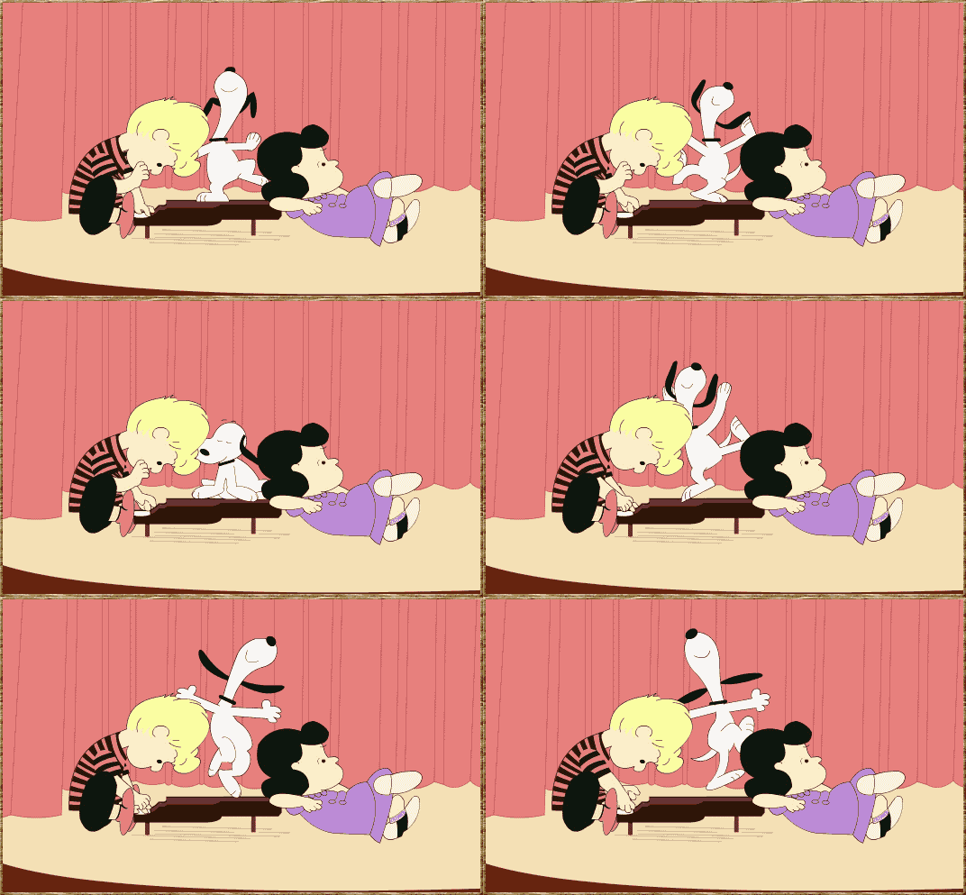
Then we start to make preparations to push the feature live (and snoopy dance a little):


Friday, January 16, 2015

EYE Witness News: Promotional Content on Webmaker

On January 28th Mozilla will be celebrating Data Privacy Day. This is an international effort centered on "Respecting Privacy, Safeguarding Data and Enabling Trust." There will be content on Mozilla, Webmaker and Mozilla Advocacy. The Webmaker team had previously developed privacy content with the Private Eye activity (featuring the Lightbeam add-on), so the primary challenge here was how to promote that content via the Webmaker splash page. This is actually a two - fold design opportunity:

1. micro: how might we promote the unique Privacy Day content on the splash page for the 28th?

2. macro: how might we incorporate promotional interest-based content into the real estate on the Webmaker splash page on an ongoing basis?

Constraints: needs to be conceived, designed and implemented within 2 weeks.

Start from the beginning 


I took a look at the current splash page. The content that we are promoting is directly connected to the Mozilla mission, so I identified a sliver of space directly above the section where we state the project's values. My thinking here is that we are creating a three tier hierarchy of values on the page: 1) we are webmaker - we are all about making - and this is what you can do right this second to get started, 2) we are deeply concerned about [privacy] - and this what you can do right now to dive into that topic and 3)we are more than just making + [privacy] - here are all the things that we value.

I SEE what you did there

That sliver was great, but it was below the non-existent but deeply considered fold of the page. If this was a painting I would create a repoussoir element to bring the users attention to the core content  by framing the edge. In the painting below you can see that tree branch that directs your attention directly into the heart of the composition.


Building off of my thinking from designing the Mozilla snippet and the onboarding ux,  I wanted to make this repoussoir element something that a user might find quirky, whimsical or relateable. All of the other elements on the page were expected and kind of standard elements for a webpage. I needed to create something that would be subtle yet attention grabbing.  Looking at subject of privacy, I immediately had associations with corporations and individuals big- brothering me as I visited web pages. I realized that the activity we were directing users to was called private eye - and this led me to create a small asset that features an eyeball that follows your cursor around as you explore the splash page. On hover it will flip and direct you to the activity.This worked for desktop, but for mobile we would have to simulate the action by having a simple CSS eyeball animation center aligned on the sliver. Major props here go out to Aki who had to invoke the pythagorean theorem to get the eye to follow the cursor without leaving the sclera.


  I did a study of eyeballs on redpen and immediately got a ton of community and staff feedback - which told me two things: 1. it was a conversation topic and 2. people liked the very first eyeball that I drew. 


Let me give you a walk through


From Mozilla's perspective, we are testing:

  • whimsy vs. traditional promotional placement 
  • mission driven content 
  • how many people are we getting to engage with Webmaker and sign up for new accounts

What's Next Up:

  • This will be deployed on staging on Monday and then our goal is to go live on January 28th, which is Privacy Day!
  • Now that we have a promotional framework, figuring out how to incorporate a richer learning experience around mission - based content.
  • Users can opt into enrolling in a sustained challenge - based Webmaker activity. Almost as if it's a virtual Webmaker club.


    Shout outs to the team that made this possible: Aki, Andrew, Erika, Paul, Dave


Monday, January 5, 2015

Shall we dance? On-boarding Webmakers

The first time that someone comes to your website is like a high school dance at the gym. You want that hottie who you have been thinking about all year to be attracted to you and join you on the dance floor . You want to show them what you are all about: how you aren't just about the MC Hammer pants and bikini top you are wearing (dating myself much?) - and you have the moves to prove it. This dance is just the beginning - you really want to go steady, but you have to start somewhere, right?

About 40-60% of users who sign up for a free trial of your software will use it once and then never come back.

When designing the on-boarding experience, we have a few goals: 
  • We should make a positive user experience where the visitor learns something within minutes of interacting
  • We should have the user take some action which results in signing up for a Webmaker account
  • We should give the user a clear and compelling reason to return.

Deeply inspired by the theory of Hanging Out, Messing Around and Geeking Out: Kids Living and Learning with New Media, I started to think about what a low bar way might be to get people to dance with me.  The idea is that there is a progression and/or just different ways that a site visitor might interact with the site. I wanted to create an experience for the user, that will allow them to walk away having seen a little bit of code, had the a ha! moment, the realization that there is so much to learn about the way that the web is crafted - and most importantly: that remixing the web is an approachable challenge.  According to this chart below, we could argue that most of our site visitors are at the beginning of the customer awareness journey.


Start from the beginning --- err where is that exactly?

I started by doing an exploratory sketch - asking where might users first see/ interact with the Goggles on Webmaker? I see 5 main areas of contact:
  1. Webmaker Landing Page with a very specific call to action
  2. Via the not-yet-existing "Join Webmaker" button user flow
  3. On the Tools page within Webmaker
  4. On the Goggles page within Webmaker
  5. Within the Goggles interface upon activating the bookmarklet
For this heartbeat (and the build sprint after) we decided to focus on number 1 via 2 (Join Webmaker user flow via the landing page) as the goal for the first quarter is to improve our conversion of visitors to Webmaker.org into makers.

Think through the user flow

With a clear scope, I took a stab at thinking through potential user flows (ahem,dance moves). What interactions might I be able to design that could help the user gain an understanding of the awesome potential of Webmaker and come away with learning a little bit about making things on the web within the first few minutes of their site visit? On a traditional site, this is where I would do a product tour - to tell the visitor about all the bells and whistles. But, let's remember, we are at a high school dance. We don't want to just tell that hottie about how great we are, we want them to hold our hand and dance with us. So what exactly is our dance? It's an introduction to the site through an interactive tinkering activity.

I had some experience tackling this user experience challenge a few months back when I designed the Maker Party snippet for the Firefox about page. Here, we were trying to coax visitors to the About Page to sign up for Webmaker AND ... (the cooler part) expose them to a little bit of code through modeling a playful interaction that they in turn would emulate. We found this approach to be successful. I personally user tested the page with a variety of site visitors in the Hive Learning Network and found that the animated modeling of the CSS value being typed acted as I would as a teacher in a classroom, or a friend showing someone how to approach the problem, asking the friend to try it out themselves. This approach could easily translate to an activity on the landing page where we show a visitor how to edit some playfully placed text using the X-Ray Goggles.

Approach 1: Modeling
Modeling tries to emulate the way you might teach this in a classroom environment - you show the actions that you want the learner to emulate.  See complete mockup here.


I also tackled this challenge of getting a user to dabble with new information and content in the weather activity experiment for the Hour of Code. Here, I thought about how I like to follow recipes and get feedback as I do each each step in a staged progression. (This would be like... someone teaching you how to do the macarena step by step at the dance)

Approach 2: Stage Progression
The staged progression allows the user to read, and then asks them to try it out, providing little tips along the way. See complete mockup here.


After getting some feedback from my colleagues and a few user testers I am leaning towards a hybrid approach - where you might model for them at each "step."

Next up: enticing your friend to get on the dance floor

All of the user flows and interaction designs are a good exercise, but if the icebreaker prompt isn't enticing, then it's no good.  So - I did a few iterations:


Name tag fill in the blank --- this could somehow tie in to the sign up flow.


Venn Diagrams - probably too designerdy but I couldn't help myself.


Fill in the blank - I <3 webmaking.="">


Fill in the blank - attempt 2. I like this one the most at the moment because it has a focal point, and it feels a bit disruptive, like Webmaker itself.

Next up: Finding those dancing shoes.
To get to an interactive prototype, we need to:
  • Design the hybrid interaction design (modeling + staged progression)
  • Choose a direction and then work on the UI elements
  • Wordsmith the copy.
  • User test with real humans!

Designing an on-boarding is like asking someone to the dance floor ----testing if your pits stink and all, so I would love to hear any thoughts if I've got any moves. 

Monday, August 4, 2014

How to learn more about Net Neutrality

Like many people, I wasn't really aware of the potential impact that opposers of Net Neutrality could have, or for that matter what net neutrality was, until I was introduced to the topic by John Oliver on his tv show Last Week Tonight. After hearing his explanation and comedic rant, I started to learn more about net neutrality. My colleague, David Steer explains net neutrality as the opinion that 
"Data, regardless of who it is from or who is receiving it, is treated equally by Internet service providers."
I like to think of it as opening up the door for 2 internets - one that comes at a cost, and another that is free. Sounds fine, right? You're like .. ok what's the big deal? I'll just use the free one. But just like many other free services that you have used that all of a sudden put up features behind a paywall, your free offering becomes crap - cluttered with ads, slower to use and just a poor man's version of the prime real estate - this too will happen with the Web. 

I believe that this issue is the most important topic for web users (globally), because without the neutral infrastructure of the internet, many freedoms that we take for granted in this hand crafted community - such as speech - become compromised in a privileged and gated web. Opposition to net neutrality threatens democracy, participation and free speech.  But this isn't a hopeless cause, there is actually something proactive that you can do to protect the Web that you love: you can learn more about Net Neutrality and explain it's importance to your small circle of the world why it's important. The goal is to create an educated groundswell that will be able to defend the open web.

Here are a few concrete ways to learn:

1. Attend the free Net Neutrality global teach-ins offered by Mozilla this week
2. Check out the the Net Neutrality kit
3. Do an activity  - here's a 1 hour activity
4. Join the conversation on discourse

I contributed to these kits by making a few activities:

I fight for #TeamInternet to save net neutrality because: You can make an internet meme explaining why you support net neutrality.


Superheroes for Net Neutrality: Calling all Superheroes! The Legion of Thorn has created 2 Webs - resulting in a dystopian state. Avenge them and defend Net Neutrality by crafting a league of superheroes to join Team Web, and remix a comic book webpage to show how they use their superpowers to save the day. 


This comic remix was made by a 7 year old

Regardless of how you learn about Net Neutrality, take some time out of your day to add it to your information diet.

Tuesday, July 15, 2014

The first 6 weeks of Hive Labs

Six weeks ago, Atul Varma, Chris Lawrence, Kat Baybrooke and I embarked on an experiment we call Hive Labs. Let me tell you about, Let me show you a little slideshow I made about our first 6 weeks to the tune of Josh Gad singing In Summer from the movie Frozen.


So, in summary (or if you aren't the musical slideshare type) the first 6 weeks have been great. We did a bunch of listening and research, including attending events and hackjams run by and for Hive members. Here's a neat worksheet from a Mouse run Webmaker training in New York. 

We did some research and design on tools and resources to support prototyping:


Sherpa is a codename for a tool that helps prototypers define a design opportunity and openly work through the process for designing a solution. We designed some mockups to see if this is a direction that we should pursue. Sherpa could be a back-end for the "Cupcake dashboard" or be a stand alone tool. We spun up an instance of the "Cupcakes" dashboard  designed by the Firefox UX team to help figure out if it is a useful tool to surface prototypes.

We also prototyped a snippet for Firefox to promote Maker Party, worked on an idea for self guided Webmaking and began work on a Net Neutrality Teaching Kit.

Finally, we've shipped some things:

The No-Fi Lo-Fi Teaching Kit asks participants the question how can we empower educators to teach the web in settings where connectivity isn't guaranteed?

With the Mobile Design Teaching Kit, participants play with, break apart and modify mobile apps in order to understand how they work as systems. This teaching kit is designed to explore a few activities that can be mixed and mashed into workshops for teens or adults who want to design mobile apps. Participants will tinker with paper prototyping, design mindmaps and program apps while learning basic design and webmaking concepts.

A local and a global Hive Learning Network directory

... and a section on Webmaker.org to help guide mentors through making Teaching Kits and Activities:


The first 6 weeks have been great, and we are going to continue to listen, create and deliver based on needs from the community. We have lots more to build. We want to do this incrementally, partly to release sooner, and partly to build momentum through repeated releases.


Thursday, June 5, 2014

Portfolio Design Workshop

Yesterday I went to a portfolio workshop for Hive NYC members at the Brooklyn Public Library. The workshop was run by Julia Vallera and the goal was to help people think through the process of developing content to showcase projects created within the Hive, however, the it ended up being so much more. By the end of the day, participants were helping members of the Hive HQ iterate on their portfolio application form, and started to articulate the need for tools that support an innovation framework.

Lifecycle of a Project 
Workshop participants reviewed the timeline of a project from exploration to the phase where you might be sharing out learnings (the portfolio touchpoint). Julia used this chart which compares the creation cycle to the lifecycle of water (how amazing is that?!). Particpants articulated that while there are lots of touchpoints and feeback loops after something has been created, there is a real desire for in-progress community support and reflection.


Portfolio template:
Participants used this template to start developing out their project portfolio piece.  Some feedback that Hive members gave is that it would be awesome if they could be developing the content throughout their making process. Additionally, they explained that it was really important to be able to identify who the author of the content was and in turn, who that author was "speaking to" via the medium of the portfolio.


Opportunity!
After listening to Hive members talk for a few hours and taking notes (below), I realized that there's a real opportunity to support what Brian from Beam Center referred to as a "framework for innovation" and what Leah from the Hive called a "living archive of process." 


I am going to tinker with Atul, Kat, Chris and the rest of the Hive community to think through what this could be, but overall I found this workshop inspiring and am eager to start noodling in this opportunity space. Some initial thoughts is that we should think through what a process dashboard and process project profile could look like. Here's what I sketched while at the workshop, but am going to dive deeper this week. 


Monday, April 8, 2013

Protyping Peer Assessment for Webmaker

For quite some time now we have been talking about the idea of integrating some form of peer assessment and feedback into Webmaker, as a way to level up an individual user's craft and community.  Today I want to share some ideas that Chloe Varelidi and I have been tinkering with and starting to actually prototype with Atul Varma.  I am going to do a little walkthrough of a potential user experience. Keep in mind that some of this is probably wrong, but I want to put it out there so that we can work on polishing those bits.
Imagine that you came to Webmaker and you were looking for a way to learn or gain specific skills. You click on the "Skills" tab (I'm sure there are tons of other names that could be more appropriate for this navigation item). On the skills page you see all of the possible badges that you can apply for - and these badges in the future will not just be individual small badges, but represent larger learning pathways. 


If a user clicks on a badge - they will learn about the badge through a playful interactive displayer and have the ability to immediately apply to earn that badge. 


When the user clicks "Apply" they are given the apply interface. This reminds the user what the criteria is for the badge, gives them the ability to upload evidence and write reflective thoughts on their process.  There are several things that we could do here, one idea was to have the user create a "how to" showing how they made their project, which eventually could be integrated into some kind of maker gallery.  What's great about this approach to "badge pledge" is that it is a useful  interaction in its own regard, and not existing solely for assessment/recognition purposes - that way there's both extrinsic and intrinsic incentives involved.


The user then submits their badge application. There are several directions that we could go from here. One option is to have all of the entries go into a queue that is accessible for mentor reviews from a secure interface that they will be able to access by logging into the queue through a mentor username and password to the site.
Another option might be to completely make this public and leverage a service like twitter. I imagine that the interaction here (after a user signs in and then clicks submit) could be similar the Army of Awesome (see below) where a the applications compile in a tweet queue and then peers pick up the individual applications to review. If we went in this direction, some more sophisticated flow will need to be developed so that there is a way to in essence vet the quality of peer review.


The actual application review for a mentor might be something like this:


Here, the reviewer can see the badge applicant's evidence and reflection and then provide feedback as well as recommend the user for a badge. One of the ideas that we had for this particular touchpoint is to create a feedback widget that encouraged constructive feedback. Taking a cue from the Lifelong Kindergarten Lab Chloe actually helped us to work on our internal tools for feedback at Mozilla meetings. Since we are often typing on etherpads during calls, we organize our feedback into categories. We added the blue one to the model to encourage collaborative making.
  • Green (what's awesome)
  • Yellow (what I am unsure about)
  • Red (what's not working)
  • Blue (an idea that I have)
Here is a screenshot of one that we recently did:


Since this has been a successful prototype for us internally, we thought that we could take this concept to a feedback widget. We were thinking of something like disqus that could be modified by different users to suit their own needs and own kinds of evaluations (imagine evaluating using just emoji's ?!!!)  The idea is that a mentor is able to click on the different colors and then is given prompts to help them to construct their feedback. In this moment they are able to recommend the badge as well. There are individual rubrics that we could create for the individual assessments as well, which is not shown.  Here is the sketch for this general idea: 


After this, let's imagine that the user was recommended for a badge. They are then sent a link (via twitter, via their Webmaker account -- depending on what direction we take above) that would look something like this:


What is worth noting here is that we include options for the user to send thanks or to rebound the feedback. This sets us up for beginning a dialog as well as using this touchpoint to evaluate the evaluator. This is a crucial step to the user flow, since it helps mentors improve their feedback, which is a skill in and of itself. There is some work that still needs to be figured out here in terms of what the interaction is if a user is not given the badge. We want that to be a positive experience. 

Chloe made this great stop motion video to quickly go over the overall interaction that I described:


Wondering what the next steps are here? Well, I am happy to tell you:

1. Prototype: We are going to use the Chicago Summer of Learning work to prototype a version of some of this interaction and then iterate on that to develop some of this flow out for Webmaker.

2. Identify mentors: we need to identify how mentors are going to play into this work flow for the Summer campaign. I know that we are going to have an active, dedicated community, however the decisions that we make around their involvement will impact some of the choices that we make moving forward with the assessment interaction design.

3. Work with the Webmaker, Mentor and Badges teams to make sure that we are all collaborating on this work.

Tuesday, January 22, 2013

Make - First Interaction Design

 On the Webmaker community call and on his blog this week, Brett Gaylor presented that we are currently aiming to solve several key design questions for Webmaker. You can read about the challenges and solutions here.

In an effort to move Webmaker into a space where from the moment you come to the site - you are encouraged to make something (what Brett is calling "make - first" interaction design) , I am going to show some prototypes that I have been working on. 

You can see all of them here in larger, more legible form.

Even though the fidelity of my prototypes might seem more polished then usual, as always please note that these are mockups and prototypes designed for the purpose of iteration, so please give me feedback and ideas for things that I should consider when moving forward with the design. 

landingpage-wire-annotated

First, lets take a look at the Landing page. The idea here is that from the moment that you land on Webmaker.org you are given the call to action to tinker and interact with content in a very real way. What you are looking at is actually a meta "Animated webpage" project that is comprised of several types of projects - so in essence the content type becomes a gallery. The page is instantly hackable and as the user, starts tinkering with an x-ray goggle like interaction- they can choose to deep dive and reveal the more advanced editing tools. While this is a mockup for the landing page - you could imagine that it is also a prototype for how a user might be able to pull and view content from the gallery - so the user gets the opportunity to digest a project first as consumable content and then engage with it as a hackable medium. This kind of interaction was deeply inspired by my reading of the work of Mimi Ito - particularly in her book Hanging Out, Messing Around and Geeking Out. Here is what it might look like with some timely content.

The next mockup is a first iteration of what a gallery could look like for us. A user does not have to be logged in to view the gallery, but if they are they will have a more personalized lens as well as the chance to engage with the content creators. 


In this mockup (which admittedly is the most nascent) you see a view of what a user might see if they are clicking on a particular users name - it's a filter of the content that the user made public. This could include their projects, badges or assets. Ideally this page will have some level of hackability - a la MySpace - so maybe the CSS of the page could eventually be modified by the individual users - since in essence this becomes a bit of a portfolio page. To be clear, I'm not saying it should look or feel like MySpace - but there was a certain level or ownership and creativity around that kind of personalization.

Finally, I'd like to share with you the prototype that I hacked up with Atul yesterday. It's a prototype, so you know don't tweet far and wide - but you can check it out to start to see what it would be like to have hackable content on a landing page and remember to click "D" for deep dive to bring that content directly into Thimble.