Wednesday, December 19, 2012

Evolving Webmaker in 2013


"Allow events to change you. You have to be willing to grow. Growth is different from something that happens to you. You produce it. You live it. The prerequisites for growth: the openness to experience events and the willingness to be changed by them." - Bruce Mau from Incomplete Manifesto for Growth

2012 was a full year for us at the Mozilla Foundation - we released Thimble, a universal navigation MVP, soft launched badges, refined and launched Popcorn 1.0 and became an active voice for Web Literacy values in the community. So where does that leave us for 2013? As Bruce Mau's beautiful sentiment here reflects, now is the time for us to live in the moment and to be strong enough to allow ourselves to be changed or affected - by users, by people who do unexpectedly amazing things with our tools, and by people who are standing next to us in the crowd and trying to get their own voice heard.

2013 is full of a lot of opportunity.  For Webmaker that means evolving our design to be a real - world learning experience. By that, I mean that we need to focus on collaborative webmaking.  At our hack jams, community calls and festivals we have seen the value and success of peer to peer learning and we need to leverage the experiences of those events and have them inform our design.

We have laid the ground work for this in 2012 by introducing badges into our ecosystem. Badges are naturally equated with skills, however they need to have a level of social value in an ecosystem to have any meaning.  That's the problem- badges for the sake of badges leave you feeling pretty flat, so you need the entire ecosystem to live and breathe as a social, collaborative environment where you have supportive peers who are invested in the skills, but also - importantly - what it takes to earn those skills. That's our mission: create an environment where making = learning. Concretely that means that our website is going to shift from a site to a platform and our suite of tools are going to evolve into a more unified experience.

Over the past few weeks, a bunch of us on the Webmaker team took some time to do the blue sky thinking that needs to happen to take a design concept to the next level. We came up with some ideas and prototypes and I am going to share a few here.  Each prototype represents a concept that we want to explore in the New Year.


1. Your Creative Cloud - We want to make it easy to collect, share and remix content from your world - and this means everywhere that you are going- whether that be collecting content from your mobile device or browser and adding that directly to a project to remix on Webmaker . Maybe in the future that means remixing Webmaker content that you have clipped or saved from your cloud on to some sort of media clipping gallery -- remixing that on the web in a more distributed manner.  Click here to see the enlarged mockup. 
 
We feel that this is one area that Mozilla can lead as we are uniquely suited to be effective here because of the precedent of bookmarking in browser in Firefox as well as with our work directly around identity in conjunction with Persona. To be clear, we don't need or want to lock you in to a uniquely browser based experience - but the opportunities for this association and leveraging of the Mozilla brand and design values are quite large. We know this is a win for us, because our colleagues over at Firefox are in- line with our thinking and we are starting discuss opportunities for us to collaborate on this piece of the puzzle.


revisionhistory


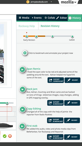
2. Collaboration as learning is a big theme for us, not just in the mockup I am showing but it is going to be a consistent and fluid theme within our tools and platform.  In the mockup above you are looking at system for using to revision history as a way to document process. Here, just like in etherpad, you are able to record your Webmaking sessions and replay them at different points in your timeline. You can see the work that you have done and how you constructed a project,  as well as how a peer who is helping to hack your project made the changes that she did. This allows for asymmetrical as well as symetrical collaboration experiences.
webmakernew-adveditor

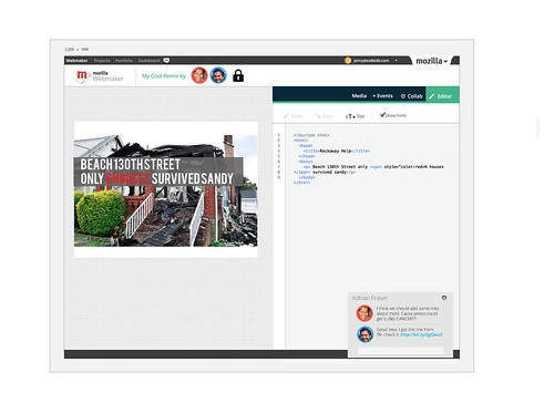
3. Making our tools speak the same language. We are trying to make the experience for an average user easier- this means putting some controls in place so that the user starts to recognize conventions and see how the Webmaker properties relate to eachother.  As you can see in this mockup, I am starting to experiment with building a more unified experience- which includes: having a unified (and single) login for Webmaker, building out common terminology, controls and User Interface - and incorporating the tools into the same experience. To be clear- this does not mean that Thimble goes away, it just means that we figure out a way for our tools to speak more clearly to the end user.
 

4.  Creating opportunitites for Community of Craft - working with peers and mentors to build the web in a social, real way. I demo-ed this prototype at the Webmaker community call and Bobby Richter helped me present it:
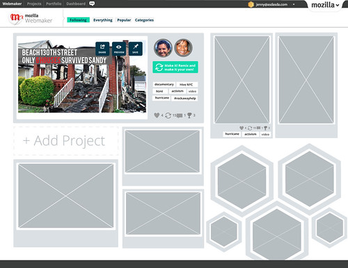
gallery-following

Imagine that you logged into webmaker.org and landed on the above gallery page.The view that you are looking at- is as if you have followed several other Webmaker users who have posted projects that they made as well as "themes" that you might have followed- for example- video projects or projects about activism. Any of these projects are remixable. You also are seeing badge graphics which, when you click on them, open up to a sub-gallery of sets of projects connected to various skills. For the moment, imagine that you are Secretrobotron going on to this page, you see a cool project by your friend and you click the green remix button which opens it directly in the editor. 


These are examples of some of the things that we have been thinking about. And this is exactly how we want to be working--- putting out crazy ideas, testing them out, seeing what sticks and iterating. Shout outs to Chris, Kate, Bobby, Atul , Brett, Chris, Erin and everyone who has been on Webmaker community calls in 2013. As I said earlier, this is an evolution of our thinking so all these ideas came out of lots of ground work, user testing , hive pop ups and festivals.

That last prototype was built in a period of 48 hours by Bobby, myself and Chris Appleton- so if all it takes is 48 hours to get some collaborative Webmaking action - imagine what we can make happen in 2013!


Reference: Check out this great post by Bobby on the prototype implementation.


Wednesday, December 5, 2012

Rethinking the Architecture of Webmaker

A few weeks back a bunch of us at Mozilla  had a design sprint to begin thinking through what it would mean for someone to come to Webmaker.org and experience it as user-not a visitor. We started to come up with a few ideas that push forward our thinking on Webmaker as a product. Some of this thinking is building off our work on Designing the Platform to teach the next generation of webmakers. Here are some takeaways from our latest conversations:

In order for us to convert visitors to users, a few things need to happen:

1. The information architecture of the overall site needs to be revisited
We can't think of webmaker.org as a regular website: we need to develop a strategy for people to immediately engage with making something on the web. This will require us to significantly rethink how we are framing our tools and content. The broad strokes view of this here is that overall, there needs to be less of a focus on tools and more movement towards the opportunity to make something.

The current architecture:


The drafty future sitemap:

click for a legible view!

So the key takeaways here are 1) we are moving away from challenging the user to choose between tool and project- they are at webmaker to make cool stuff- and learn while they are doing that- so let's make it easy for them and 2) overall this is a more personalized experience- there are user profiles, dashboards, content that is unique to the user based on their webmaking history, etc.  You can check out the etherpad where we are working through the details here.


2. Single sign on needs to be implemented 
In order to implement a lot of our vision for Webmaker, we need a single sign on- and a built in value for that sign on. Right now the singular value proposition for signing in to Thimble is badges. Yeah, it's more than just a gaming point, it's embedded assessment- but we could be doing so much more - users could get analytics on their webmaking-what are their trends? The kinds of things that they make on a regular basis-only Popcorn projects?, what kind of code do they prefer? JS, pure HTML? How many remixes have they made? The sign on can happen at several different touchpoints- the landing page- or via a button in the universal navigation.

So the landing page might end up looking more like this:

 or this:
This will affect users in several ways, the least of which---they can actually be "users" of webmaker.org- save and share their work, but it also takes me directly to #3:


3. The universal navigation needs to be implemented across all properties

We currently have a version of what could become the universal navigation implemented in Thimble:

Eventually, this is going to live across all webmaker properties and  transform into a more dynamic navigation/dashboard/ toolbar. So for example, instead of just linking to "Projects" it can link to "My Projects"

 
4. More user- centric content needs to be prioritized 

User centric content will live across Webmaker, so that it becomes a more social platform- and importantly, taps into the social platforms and places that people are already inhabiting on the web outside of webmaker.

One thought is to make a dashboard- that offers users a conceirge to help them figure out what they want to do, but also provides them data about their work, suggestions of things to make based on their usage habits.

Another thought it to build out the gallery to be more social and user friendly- so that might mean that a user can follow other users, or recommend peers for badges, create working groups or collaborative hacking sessions. But for starters---we need a gallery, one that integrates user generated content and mozilla starter projects. It will need to be curated but this can also be done dynamically based on user preferences and interactive filters.

There will also be places for people to store their work, collect assets from across the web and initiate collaborative webmaking.

5. Identify touchpoints for "teaching" or peer mentoring.
This one is a little bit less defined than the others, mainly because we need to work with the Learning/ Hacktivators/Hive/ Community teams to identify the need and opportunity here. In general since we see webmaker as a self directed, online experience similar to physical events like the Mozilla Festival-we want people to be able to share lessons learned easily with their peers.  This probably won't mean one section roped off for educators, but an embedded experience, perhaps when a user makes something-they can share a video documenting their process with a friend--- maybe on publish you are giving a hacktivity kit - there is a lot of interest here, and a chance to be innovative.


So that's the general direction of our thoughts over from the UX camp. It's a lot and it's messy but it's all good. Would love feedback. This week I will be working on building out the Webmaker Product vision. Much of this might morph into something else- but I want to document it so we can trace our thinking. I will post on the vision next week.

Lot's of good thinking is happening all around, however, I recommend reading these posts by Chris Appleton that focus on how we might approach Projects, and User Accounts:


Tuesday, December 4, 2012

The Value of Showcasing Craft

Lately I've thinking been about how we can value the craft of webmaking within the context of Webmaker.org. The topic is fresh on my mind because we are starting to seriously think about how to develop out a gallery presence for the platform that is true to the spirit of our community. This got me to researching a bit about how other web properties highlight this stage in the design process.

Threadless does a nice job of surfacing the process of individual t-shirt designers on their site. Very simply, they have a curated section of blogposts featuring designers going into detail about how they made the product.


First they profile the user, and then they show great process shots like this one below by Joshua Kemble:


Additionally, they have a critique section of their site, where users can rate in-progress shirts and provide feedback via commenting. Again, super simple and effective. There are so many reasons to do this kind of highlighting of process, but for Threadless, it serves three functions well: 1) as an educational resource that isn't in your face "here is how it is made," but in fact offers many ways to make similar things and 2) as a way to elevate their product- they highlight masters who have done cool work, and show you how to do that too and 3) as a way to build community.

Sketchpad.cc highlights process but in a very different way. In their gallery, instead of just showing the end product, they include the code which can be seen as a video replay. I find it compelling because it allows you to see the different decisions that the creator made when designing the animation. In turn the entire process is treated as a journey. I've seen other sites do similar things, and in a less organic way, a lot of cooking websites do this with their video documentation of their step-by-step tutorials, but I like that it's not really a tutorial- that the verb - or the action is actually an appreciated part of the design- possibly even elevated higher than the end product.


So we have two forms of process documentation so far, and my last site that I am going to talk about is so documentation heavy- that it might blow your mind: Github. Like other version or bug trackers, here you find a community of people who are collaboratively crafting documentation for their project. I like this as an example because you can see the history and different phases of the project.  So on an incremental level you can see how the project was built up, who forked what code, who hacked what - and from time to time, particularly with their "Issues" section of the app- you can see conversations about how decisions were made.


It seems like there is some awesome formula for success here- like 1 part documentation plus 2 parts social plus 1/8 part inspiration, 2 tsps of process and 4 cups design thinking = craft. 
Right now we are still in the research phase of the gallery for Webmaker- but what's clear to me is that it needs to accomplish a few things: it needs to be social, inspiring, educational, live across the web, and very importantly - have some level of showcasing the craft of making things on the web.