Showing posts with label openbadges. Show all posts

Thursday, March 6, 2014

Designing BadgeKit

After several months of hard work by the Open Badges team, we are announcing that BadgeKit is  available for access to Private Beta. This means that BadgeKit is now available in two forms:  a hosted version of Mozilla BadgeKit available in private beta for select partner organizations that meet specific technical requirements, and anyone can download the code from GitHub and implement it on their own servers. 

BadgeKit is a set of open, foundational tools to make the badging process easy. It includes tools to support the entire process, including badge design, creation, assessment and issuing, remixable badge templates, milestone badges to support leveling up, and much more. The tools are open source and have common interfaces to make  it easy to build additional tools or customizations on top of the  standard core, or to plug in other tools or systems.

From a design perspective, this milestone represents refinements in user research and testing, user experience, user interface and branding. 

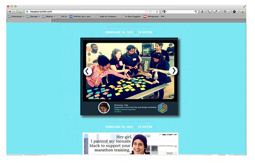
We did user testing with members of the Hive in Brooklyn.
In preparation for this release, we conducted extensive user research to define the needs and goals for badge issuers. This work, led by Emily Goligoski, helped to define requirements for the BadgeKit offering as well as inform the user experience. The research was done using a variety of methodologies, however, it is worth noting that all of this work was done in the open. Emily organized distributed user testing in key markets such as New York, Chicago and Toronto to do everything from needs analysis to accessibility and functionality testing. The Open Badges weekly community calls were leveraged to pull in input from the highly motivated research and practitioner cohorts. Much of the work is documented both on her blog and in github. We paired every implementation milestone with some form of user testing and iteration. While this may sound obvious, it was a new way of working for our team, and I can unequivocally say that the product is better because of this practice. User research and testing did not happen in a bubble, but rather it became completed integrated with our design and implementation cycle. As a result, developers and designers became comfortable making informed iterations on the offering, as developers, designers and team researchers all participated in some form of user testing over the past three months. 

As a direct result of the extensive research and testing, the user experience for the entire BadgeKit offering was deeply refined. This work, led by Matthew Willse introduced some new features, such as badge “templates” which give the ability for any badge issuer to clone a badge template and remix it. This gives us the unique ability to offer template packages based on common badge requests from the community, as well as eventually to empower the large Open Badges ecosystem to develop badge templates of their own (and perhaps explicitly state how they are comfortable with their content being shared and remixed). One component of this work that evolved as a direct result of testing, was the increased attention to copy. Sue Smith led this work, which entailed everything from tool tip development and a glossary to API documentation. Considering that BadgeKit takes an issuer from badge definition


and  visual design


 to assessment and issuing,

designing the user experience was no small effort and the attention to detail combined with designing in the open - proved to be a solid approach for the team. 

Perhaps the most obvious design component of this release is the user interface design and brand definition. Adil Kim kicked off this work with an exploration of the brand identity. BadgeKit is under the parent brand of OpenBadges, which sits under the even larger parent brand of Mozilla - which gave us the constraints of designing within the brand guidelines. After exploring options to represent the visual metaphor for this modular system, here is the new logo:


The logo is meant to evoke the imagery of both a badge as well as a tool in one glance. For the untrained craftsperson (ahem) - while gazing into the mark - you will see a bolt . This connotes that BadgeKit is a tool, something that allows you to dive into the details and construct a badge, and a system for your community. The logo incorporates the palette from Mozilla Open Badges, in a playful mobius - at once implying that while this is a handcrafted experience, it is also a seamless one. This logo nicely fits into the larger brand family while reading on it’s own, as if to say, “hey, BadgeKit is the offering for badge MAKERS, dive in and get your hands dirty!” 

The brand is in turn extended to user interface design. The overall art direction here was that this needs to be clean, yet approachable. We know that many organizations will not be using all of the components in the interface directly on badgekit.org, however, the design needs to take into account that everything needs to be accessible and read as remixable. Some details to note here are the simplified navigation, the palette and subtle details like the ability to zoom on hover over thumbnails. 

It’s worth noting that while Emily, Matthew, Sue and Adil , as well as Carla, Meg, Erin, Jade, Sabrina Ng, Chloe and Sunny were invested in much of this design work, there was an intentional yet organic partnership with the developers (Zahra, Erik, Andrew, Chris, Mavis Ou, Mike and Brian + many, many community contributors) who were doing the implementation. We had weekly critiques of the work and often engaged in conversation about design as well as implementation on github. 


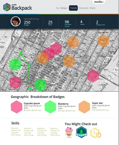
Another component of this work is looking ahead towards future features. Chloe Varelidi lead work here thinking through the potential for badge and skill discovery. Under a grant from The Bill & Melinda Gates Foundation, Chloe and her team are thinking through ways to represent earner pathways. This eventually will be leveled up into the core BadgeKit offering, but you can start to dip your toes into those features by checking out the work here.

And the good news is that design never ends! Design isn’t just a destination, it’s an invitation to a conversation. Check it out, let us know what’s working and importantly, what’s not.

Saturday, November 16, 2013

MentorN00b : matchmaker matchmaker make me a match!

I have been doing a lot of little projects for one off events lately.  Like this badge claim page I made for the recent Mozilla Summit:

summitsuite 

Or the one that I made for Mozilla Festival:
draft 
Usually we try to make one - offs more meaningful by actually doing some iteration on them or using them as a use case to inform the core product that we are actually working on.  So for example, I will probably work with our development and design team to figure out how to incorporate these kinds of claim pages into BadgeKit and will use the feedback that we got by standing and watching hundreds of people "test" out the sites as a usertesting and research exercise.

For these two events we also made something that I would put in the category of "schwag". Which, yeah - can totally be fun to make, but kind of usually feels a little meaningless. Here are the buttons that my teammates Chloe and Emily and I made for the events to help people to get interested in Open Badges:


This exercise, (I have to admit - quite surprisingly) turned out to be a meaningful design exploration that keeps on giving to us things to think about on the badges project. As Emily explains in her blogpost, the badges took on another life in practice. People hacked them and used them to give peers a glimpse of their identity - but not just identity with a capital I - really a deeper, more nuanced thing - how people self identify.

One day, I was in a coffee shop with Atul and Mike - thinking about the badges schwag and we were kind of doing our usual brainstorm of - wouldn't it be cool if ..... - and we came up with an idea for a prototype that could have pretty tight parameters. I would categorize this as a prototype that's not designed to scale. 

What we realized was - that at these events we would be seeing people with different kinds of expertise and desires and how in a perfect world we would match-make button wearer's so they could help each other out to learn skills. So for example, my button said that I was a javascript n00b and if Mike's button said that he was a javascript nin.ja we could be paired together.


What the three of us started to hack on was an app - where people could sign in, state their interests and then get paired with a like-minded friend to help mentorship. I could imagine this being something that could be taken further - so after a match is made, a mentor could help a n00b to develop a learning map/goal or trajectory and suggest or create badges for the n00b to work towards. Using the tools offered in BadgeKit, the mentors could then provide peer assessment for the n00bs. Additionally, the feedback loop could be closed by the n00b then giving the mentor through various kinds of mentor badges. This would in essence develop a mentor - n00b community and give participants the ability to always identify as somewhere on the spectrum for different skills or activities as mentors and/or n00bs. I particularly like this idea - that someone could be a mentor and a n00b at the exact same time. 

Here is a mockup that I worked on to start to express the idea:


We haven't gotten super far with the prototype, but I could see this as something that might be interesting to test out with the Hive or the mentor community activities at Mozilla.

Wednesday, July 31, 2013

Badgopolis: Form follows emotion

" Form follows emotion"
- Hartmut Esslinger

The design guru behind Frog design, Hartmut Esslinger hacked the design principle popularizied by modern architecture and industrial design in the 20th century "form follows function," to imply that at the end of the day a user wants to interact with products that they have some kind of emotional connection to - resulting in the charged credo of "form follows emotion." I am reminded of this as I kick off a prototype code named "Badgopolis" that seeks to build a stronger relationship between a learner and their data around learning.

In my last post, I wrote about how I sometimes don't see myself as a designer. Although this was unintended, as a result,  I got several responses confirming that in fact I am a designer. This post was fairly thought provoking for me because on some level I was projecting a very personal internal conflict that I have regarding my identity and work. I wrote the post because I was trying to understand my personal connection to badges, and what they could offer me - Jess Klein - as an individual. While I currently am employed in a job that I love, and surrounded by a community of intellectuals and design thinkers, I notice that I am constantly pushing myself to round out my work and to become what I consider to be a real designer.  This is a good desire, in my opinion, because I am constantly pushing myself to go further in my field and refine my craft. However, I also wonder if I will ever feel satisfied - because I have no perspective on what a real designer actually is: it's just this intangible goal at the end of a race that I don't truly have the directions of the course for.

When I look at the current Open Badges Backpack, I see a product that is functional and that can probably be liked, but I doubt that anyone would love it or find it a meaningful tool that they have some emotional connection to. So, I wonder - why would anyone use this? How would I use this? How will it help me to feel like a real designer and continue to enjoy my lifelong learning?

On a very basic level a Badge Backpack currently is a place to store open badges and share them out with the world - big deal. But there are a lot of reasons that this should be a BIGGER DEAL. For starters, learners throughout their lives are constantly creating their "data" around their learning for someone, but rarely for themselves. This is an opportunity for learners to reclaim their data and to use it as a tool for analysis, self reflection and wayfinding. I don't have an answer as to how we can evolve our current Open Badges offerings yet, but I have a few rough ideas and some teaser images.

1. Transform the backpack into a personal dashboard for a learner to track, analyze and inform their learning.

backpack 

2. Make discovery a social and informed experience. 

Imagine that a directory for all of the public badges existed - alongside suggested pathways or courses that you could take to increase your interests and expand your skillsets, like an IMDB for Badges - how could you use that?  


3.   Customize the way that a learner can share their portfolios and data.

A learner should have full control over their data and have the ability to curate badges and metadata in such a way that they can choose to share select pieces of information - or keep that data personal. Most importantly, imagine if there were super simple ways to use the data to populate spaces that users are already inhabiting? With this line of thinking the backpack might become a tool, but not a landing page or destination.

tumblr

These ideas were co-created  based on  a series of conversations with the Open Badges team and community - including several late - night prosecco - infused chats with Erin Knight and Sunny Lee. The prototyping team is: Chloe Varelidi, Emily Goglioski, Atul Varma and Carla Casilli

I look forward to hearing your thoughts as I continue to update with the prototyping process.  However, I do have one question for you - how might you change the backpack to make it more compelling for someone to feel connected to their data?

Monday, April 8, 2013

Protyping Peer Assessment for Webmaker

For quite some time now we have been talking about the idea of integrating some form of peer assessment and feedback into Webmaker, as a way to level up an individual user's craft and community.  Today I want to share some ideas that Chloe Varelidi and I have been tinkering with and starting to actually prototype with Atul Varma.  I am going to do a little walkthrough of a potential user experience. Keep in mind that some of this is probably wrong, but I want to put it out there so that we can work on polishing those bits.
Imagine that you came to Webmaker and you were looking for a way to learn or gain specific skills. You click on the "Skills" tab (I'm sure there are tons of other names that could be more appropriate for this navigation item). On the skills page you see all of the possible badges that you can apply for - and these badges in the future will not just be individual small badges, but represent larger learning pathways. 


If a user clicks on a badge - they will learn about the badge through a playful interactive displayer and have the ability to immediately apply to earn that badge. 


When the user clicks "Apply" they are given the apply interface. This reminds the user what the criteria is for the badge, gives them the ability to upload evidence and write reflective thoughts on their process.  There are several things that we could do here, one idea was to have the user create a "how to" showing how they made their project, which eventually could be integrated into some kind of maker gallery.  What's great about this approach to "badge pledge" is that it is a useful  interaction in its own regard, and not existing solely for assessment/recognition purposes - that way there's both extrinsic and intrinsic incentives involved.


The user then submits their badge application. There are several directions that we could go from here. One option is to have all of the entries go into a queue that is accessible for mentor reviews from a secure interface that they will be able to access by logging into the queue through a mentor username and password to the site.
Another option might be to completely make this public and leverage a service like twitter. I imagine that the interaction here (after a user signs in and then clicks submit) could be similar the Army of Awesome (see below) where a the applications compile in a tweet queue and then peers pick up the individual applications to review. If we went in this direction, some more sophisticated flow will need to be developed so that there is a way to in essence vet the quality of peer review.


The actual application review for a mentor might be something like this:


Here, the reviewer can see the badge applicant's evidence and reflection and then provide feedback as well as recommend the user for a badge. One of the ideas that we had for this particular touchpoint is to create a feedback widget that encouraged constructive feedback. Taking a cue from the Lifelong Kindergarten Lab Chloe actually helped us to work on our internal tools for feedback at Mozilla meetings. Since we are often typing on etherpads during calls, we organize our feedback into categories. We added the blue one to the model to encourage collaborative making.
  • Green (what's awesome)
  • Yellow (what I am unsure about)
  • Red (what's not working)
  • Blue (an idea that I have)
Here is a screenshot of one that we recently did:


Since this has been a successful prototype for us internally, we thought that we could take this concept to a feedback widget. We were thinking of something like disqus that could be modified by different users to suit their own needs and own kinds of evaluations (imagine evaluating using just emoji's ?!!!)  The idea is that a mentor is able to click on the different colors and then is given prompts to help them to construct their feedback. In this moment they are able to recommend the badge as well. There are individual rubrics that we could create for the individual assessments as well, which is not shown.  Here is the sketch for this general idea: 


After this, let's imagine that the user was recommended for a badge. They are then sent a link (via twitter, via their Webmaker account -- depending on what direction we take above) that would look something like this:


What is worth noting here is that we include options for the user to send thanks or to rebound the feedback. This sets us up for beginning a dialog as well as using this touchpoint to evaluate the evaluator. This is a crucial step to the user flow, since it helps mentors improve their feedback, which is a skill in and of itself. There is some work that still needs to be figured out here in terms of what the interaction is if a user is not given the badge. We want that to be a positive experience. 

Chloe made this great stop motion video to quickly go over the overall interaction that I described:


Wondering what the next steps are here? Well, I am happy to tell you:

1. Prototype: We are going to use the Chicago Summer of Learning work to prototype a version of some of this interaction and then iterate on that to develop some of this flow out for Webmaker.

2. Identify mentors: we need to identify how mentors are going to play into this work flow for the Summer campaign. I know that we are going to have an active, dedicated community, however the decisions that we make around their involvement will impact some of the choices that we make moving forward with the assessment interaction design.

3. Work with the Webmaker, Mentor and Badges teams to make sure that we are all collaborating on this work.

Monday, January 28, 2013

Design Feedback for Badge Systems

Last week I participated in a workshop for Digital Media and Learning grantees. Everyone at the workshop presented their progress on creating open badge systems for their organization. It was my role during the workshop to act as a design expert, to give feedback on the projects and help facilitate a conversation about the design elements of their work.  Over the course of 2 days, I listened to detailed presentations about badge system design, learning theory and communication plans and realized that some themes were emerging. For today's post, I thought that I would share my 5 most common bits of feedback that I gave out to the grantees.


1.    Get to know your end-user
Take the time to think through your user persona and user flows. Remember that you have a specific human using your product and they are receiving the badges that you create. Get really specific here and come up with a user story and test that against your designs. 
For example: My user's name is Adrian, he is 18 years old and enjoys reading Science Fiction books, riding his bike and exploring New York City. He is participating in this after school program because he has a passion for math and has felt relatively uninspired by his in-school options. He does this program on Wednesdays after school and has already earned badges for peer mentoring, leadership and problem solving. These are particularly meaningful for him because he wants his peers to know that he is not only a smart guy, but really has street cred in the math community. He posts his badges both in his school LMS and on his personal Facebook page.

From my example, we can already learn a few things that will help inform some design decisions. We know he is doing this work as an extracurricular activity, so we want to frame the work as informal and we know that he is more interested in the social capital that he gains from this experience outside of the classroom and school community, so he is invested in the badges being flexible and shareable. 
You probably will have 3 or 4 types of users for any given product. Embrace that and come up with unique user stories that are based on real life use cases.

2.    Badges and identity
Think about how your badges communicate or enhance an end-users identity. This might seem like an obvious one, but it's crucial to think about how the end-user relates to the badge on a personal level and how that might inform their identity, both within the context of your tool or badge system design and outside of that framework in the real world. On a simple level, think about how might be naming the badges and ask yourself - does this have resonance with the badge recipient? What is more appealing "CSS 101 badge" or "CSS Super Styler"? Think about how this relates to the visual design as well, are you offering something that would have more significance to your organizational brand than to your users brand or identity? If so, then I would recommend reviewing the design and iterating.


3.    Badge design 
It's important to remember that 90% of the badge system design is not visual. Take the time to go and think through all of the touchpoints for badges and ask yourself "are they meaningful experiences?" and if they are meaningful - who are they meaningful for? Once you past that test, then you can move on to visual design. I gave a webinar on this about a month ago and put the slides up on a Google Doc here

The top level things to consider are legibility, scale and typography. Open badges are relatively small graphics, so think about that when you are designing them. Reduce the amount of graphic complexity as much as humanly possible. Ask yourself if you even need to incorporate text into the badge - because this adds an additional layer of content that a user needs to digest. I pull this point out separately because I don't think that text is needed because the backpack and/or system distribution could include that information alongside the badge, giving you the opportunity to free up your design. Badges are like icons, you need to attempt to communicate as much as possible with the fewest elements as possible.


4.    User Testing 
How can you engage your community in user testing and analysis? Can you think of ways to work in a more agile way- incorporating feedback and testing so that you are putting out releases that build on your learning and findings from fieldwork and testing?  All of the questions that you have about your design will be acknowledged the second that you have someone who is unfamiliar with your project review your work.
And, as part of the DML/ MacArthur/ HASTAC / Mozilla community- you can ask us for help. Yeah you have a grant deliverable, but you have a community right here who are asking themselves the same design questions and are a perfect user tester. That said, I would take the time to mix up your user tests - have friends and family, but also include complete strangers. 

Remember, user testing can be as informal as throwing two badge designs in front of a user and asking them which one they prefer and why. Don't be intimidated by the term user testing - in reality, what is more intimidating is putting out a product that will be used by hundreds of people that has not been tested.

5.    Metrics and dashboard Data
My final bit of feedback has to do with how you are valuing success but more importantly about how your end user values success, learning and skill acquisition. Many of the dashboard type tools that I saw were actually speaking to how an institution or organization values success within a Learning Management System (or badge system, or tool etc.) but not how the end - user values success. So for example, the tool was designed for the high school teacher instead of the high school student. Remember that success and metrics is something that can be shared and communicated to users as part of their experience within the product offering and it is an opportunity to help a user challenge themselves to level up or exceed both your and their expectations. In terms of design, this might mean that you should consider surfacing some of this data. 

Design needs to constantly be iterated upon, however, if done correctly it will be a huge contributor to the success of your badge system design. So go forth, and design with courage. Use this top 5 list as tools in your arsenal to help you craft a meaningful user experience.

Thursday, September 13, 2012

Demo: Getting Badges in to Thimble

Lately we've been preoccupied with getting a working proof of concept prototype for issuing badges in the Thimble and Popcorn editors. As I've talked about before, badges give you the opportunity to gain embedded assessment and real time feedback during your web making activity.  Our goal is to get badges into Thimble by the Mozilla Festival, so we really needed a proof of concept as a jumping off point for us to move forward with iterating. Here is a demo of that prototype made by myself and Atul Varma:


You can check out the actual prototype:  here: http://thimble-badges-movie.toolness.org/

The prototype doesn't represent the look and feel or the user experience design, however it does explore all of the different components of getting a badge within the editor and allows us to see what the touchpoints are for the end user.

Monday, July 23, 2012

Building the Next Generation of Web- Craftsmen

I was reading this article this morning in the NY Times by Louis Uchitelle about the American workforce and how we are losing our value of craftsmanship, and it got me thinking about the word "craft." 

Photo by Michael Falco of the NYTimes

We are at a stage where we are building up the contents of our "toolbox" at Mozilla, figuring out ways to sharpen those tools. We have Popcorn, X-Ray Goggles and Thimble- as well as learning projects that can accompany those tools within the context of the tool or in the form of a D.I.Y. recipe.  I am wondering, however, in the long run- how are we going to turn web-hobbyists into web-craftsmen (women, girls and boys)?  We are designing badge systems and trajectories, for our learning content at Mozilla,  which will reveal to our users pathways for further exploration, but in project based learning, I wonder what that extra secret ingredient is that will empower someone to go above and beyond and refine their work to the point that it is a craft.


Implicit in the word craft is some understanding of design, whether that be design of the system, the tool or the concept. In fact, the American Craft Museum (my former employer) has now changed their name to the Museum of Arts & Design. To some degree, the name change was because the term "craft" has lost its relevance in our society- people think of old women crochetting doilies when they hear craft. However, more and more I hear people reclaiming the word and using it as a brand advantage- something that was made by hand. The Renegade Craft Fair,  encourage local artisans to connect with eachother and show (and sell) their wares. Two key takeaways that I have from being a participant in their events is 1) a emphasis on hand- made design and 2) a celebration of community. I believe, these might be the two ingredients required for craftsmenship.

Do not call Atul Varma a codemonkey!


Design is a concept that extends far beyond "coding" when we talk about it in the context of webmaking. When someone creates a webpage, for example, a lot more goes into it than just implementing it- there is the concepting phase- where you brainstorm and make decisions on what and why of your page, the asset creation stage and finally the implementation stage.  It's the big picture.  The developers who I work with at Mozilla understand this. In fact, Atul, my thought partner at Mozilla, and co-developer of Hackasaurus hates it when people refer to him as a "code monkey" (someone who only inputs code)- and while I would only ever say that expression in jest,  the reason he gets so offended is that he is a craftsman. He researches, he tinkers, he looks for a community and ultimately, shares his work within that community. In short, he designs, develops and contributes to a community.

Learn about how much character (get it?) is inside your browser!

In the article, the author mentions how people know how to use their computers but they don't know how to build them- which got me starting to think about what the appropriate analogy is for the work that we do- because yes I could force teens to take apart their computers - but I think that doesn't resonate in the same way that it did for us in the 80s/90s. I think that the canvas for today is not the computer, but the browser- and I feel that deconstructing that browser will help learners understand what is possible- and why it is important to refine your craft to the point that your work is not just digestible data, but beautiful content that is accessible. Atul and I started to dabble with this idea using the Navigator badge concept- but I would love to push that further, and not think about the assessment, but the lessons here.


Hive NYC has developed a community of practice amongst professionals and learners

The community piece is a bit tricky because there are so many ways for us to engage communities. One way, is to build communities of practice with professionals and youth at like minded organizations- which is what we are doing with Hive NYC at Mozilla.  Another way would be to meet youth where they already are, which is kind of the beauty of modular concepts like Open Badges- because it wouldn't matter what circle a learner is based in, because they would be able to show their skill through an understood social currency that is backed up by a portfolio of work. Then again, there are other ways, like imagine mixing the making piece within the context of a community of online practice- like hacking facebook to be the best facebook within facebook- with your facebook peers (oh yeah, that sounded like Inception!)

I often say that the web is a handcrafted community and medium- one that was created by individual people who work to make it reflect of our own local interests. If we are to elevate the level of innovation and representation within the web, we need to develop a community of web- craftsmen. That means providing tangible learning tools and projects, trajectories that implicitly incorporate design thinking and integrating with communities of practice. 

Wednesday, March 7, 2012

Website Refresh: openbadges.org

Last week I worked with the Open Badges team to refresh the openbadges.org site. I came into the project about 2 weeks prior to the launch, so there were some seeds of ideas to work from- mainly due to the work of Erin Knight, Carla Casilli and Sunny Lee, however some of the things that I worked on include:
  • A new, clean and streamlined look and feel
  • Many new assets including character illustrations
  • Direct entry points for various constituents
  • A slideshow and quiz that educates you about badges and then gives you a chance to earn a badge 
  • A pathway to push the badge to your Backpack and check out all the features
The launch was timed to coincide with the Digital Media and Learning conference, which gave me the unique opportunity to design the site and then immediately watch tons and tons of users try it out and respond. Obviously users immediately responded to the design, because they were used to something that looks sorta like this:


and got this:


Since the site was very content heavy- I tried to create illustrations  that where whimsical but fairly clean. I will say that we did add some fun little animations to the project just to spice things up a little. Gladis, the name of the character on the landing page actually wiggles after about 20 seconds for example and the badges actually scale up on hover. We did this to infuse some sense of play into the work. With the characters, I was ultimately trying to have each character embody the identity for the pathway to engagement with the site: an issuer, user and displayer. I did a ton of illustrations  and work for the site- but  here are the character illustrations:


gladis                         borismortydorothy 


Another feature to the site is taking a quiz to earn your first badge. To do this, we designed a modal window that would allow a user to get a brief schooling in badges-- get the ironic pun? This is something that definitely needs to be iterated on some more to be a bit more of an authentic experience- but hey, we are Mozilla and we iterate in the open.


Since I came into the project as a bit of a special forces unit, I am probably not going to be too involved with this work in the future- but I really had a fantastic time working on it and being part of a bigger team. Big shout out also goes to Mike Larsson who worked closely with me on coding and helped make  decisions about the design direction. And of course- Brian Brennan, Atul Varma and Chris McAvoy helped us to iterate and pushed the project forward.