When I was creating the patterns for the Webmaker privacy campaign, I posted my works-in-progress up on Instagram and a few people asked if I would make them into desktop wallpapers. So... in honor of Data Privacy Day you can download them in a variety of patterns and sizes here.
Doodle Pattern: 320x480 | 800x600 | 1024x768 | 1280x800 | 2560x1440
Hexagon Pattern: 320x480 | 800x600 | 1024x786 | 1280x800 | 2560x1440
Wink Pattern: 320x480 | 800x600 | 1024x768 | 1280x800 | 2560x1440
This work is licensed under a Creative Commons Attribution-ShareAlike 4.0 International License.
Wednesday, January 28, 2015
Tuesday, January 27, 2015
Quality Assurance reviews for Design, Functionality and Communications
This week a few of the features that I have been writing about will be shipping on webmaker.org - the work for Privacy Day and the new on-boarding experience. You might be wondering what we've been up to during that period of time after the project gets coded until the time it goes live. Two magical words: quality assurance (QA). We are still refining the process, and I am very open to suggestions as to how to improve it and streamline it. For the time being, let me walk you through this round of QA on the Privacy Day content.
It all starts out with a github issue
... and a kickoff meeting
The same team who worked on the prototyping phase of the Privacy Day campaign work are responsible for the quality assurance. We met to kick off and map out our plan for going live. This project required three kinds of reviews - that more or less had to happen simultaneously. We broke down the responsibilities like this:
Paul - (communication/marketing) - responsible for preparing the docs and leading a marketing review
Jess - (lead designer) - responsible for preparing docs and leading design review
Bobby - (product manager) - responsible for recruiting participants to do the reviews and to wrangle bug triage.
Cassie - (quality) - responsible for final look and thumbs up to say if the feature is acceptable to ship
Each of us who were responsible for docs wrote up instructions for QA reviewers to follow:
We recruited staff and community to user test on a variety of different devices:
This was done in a few different ways. I did both one on one and asynchronous review sessions with my colleagues and the community. It helps to have both kinds of user tests so that you can get honest feedback. Allowing for asynchronous or independent testing is particularly beneficial because it signals to the reviewer that this is an ongoing process and that bugs can be filed at any point during the review period specified.
The process is completely open to the community. At any given point the github issues are public, the calls for help are public and the iteration is done openly.
and if there were any problems, they were logged in github as issues:
The most effective issues have a screenshot with the problem and a recommended solution. Additionally, it's important to note if this problem is blocking the feature from shipping or not.
We acknowledge when user testers found something useful:
and identified when a problem was out of scope to fix before shipping:
We quickly iterated on fixing bugs and closing issues as a team:
and gave each other some indication when we thought that the problem was fixed sufficiently:
When we are all happy and got the final thumbsup regarding quality, we then....
Close the github issue and celebrate:
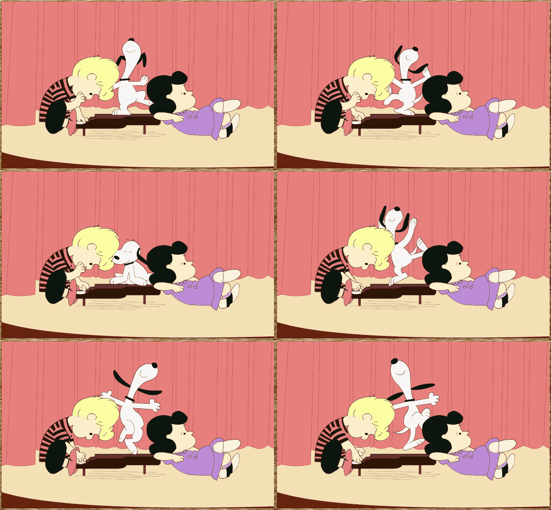
Then we start to make preparations to push the feature live (and snoopy dance a little):
Labels:
communications,
community,
design,
functionality,
mozilla,
QA,
quality assurance,
webmaker
Thursday, January 22, 2015
Dino Dribbble
The newly created Mozilla Foundation design team started out with a bang (or maybe I should say rawr) with our very first collaboration: a team debut on dribbble. Dribbble describes itself as a show and tell community for designers. I have not participated in this community yet but this seemed like a good moment to join in. For our debut shot, we decided to have some fun and plan out our design presence. We ultimately decided to go in a direction designed by Cassie McDaniel.
The concept was for us to break apart the famed Shepard Fairey Mozilla dinosaur into quilt-like
tiles.
Check out our new team page on dribbble. rawr!
Cassie also wrote about the exercise on her blog and discussed the opinion position for a designer to join the team.
The concept was for us to break apart the famed Shepard Fairey Mozilla dinosaur into quilt-like
tiles.
Each member of the design team was assigned a tile or two and given a shape. This is the one I was assigned:
We all met together in a video chat to upload our images on to the site.
Anticipation was building as we uploaded each shot one by one:
But the final reveal made it worth all the effort!
Check out our new team page on dribbble. rawr!
Cassie also wrote about the exercise on her blog and discussed the opinion position for a designer to join the team.
Friday, January 16, 2015
EYE Witness News: Promotional Content on Webmaker
1. micro: how might we promote the unique Privacy Day content on the splash page for the 28th?
2. macro: how might we incorporate promotional interest-based content into the real estate on the Webmaker splash page on an ongoing basis?
Constraints: needs to be conceived, designed and implemented within 2 weeks.
Start from the beginning
I took a look at the current splash page. The content that we are promoting is directly connected to the Mozilla mission, so I identified a sliver of space directly above the section where we state the project's values. My thinking here is that we are creating a three tier hierarchy of values on the page: 1) we are webmaker - we are all about making - and this is what you can do right this second to get started, 2) we are deeply concerned about [privacy] - and this what you can do right now to dive into that topic and 3)we are more than just making + [privacy] - here are all the things that we value.
I SEE what you did there
Building off of my thinking from designing the Mozilla snippet and the onboarding ux, I wanted to make this repoussoir element
something that a user might find quirky, whimsical or relateable. All
of the other elements on the page were expected and kind of standard
elements for a webpage. I needed to create something that would be
subtle yet attention grabbing. Looking at subject of privacy, I
immediately had associations with corporations and individuals big- brothering
me as I visited web pages. I realized that the activity we were
directing users to was called private eye - and this led me to create a
small asset that features an eyeball that follows your cursor around as
you explore the splash page. On hover it will flip and direct you to the
activity.This worked for desktop, but for mobile we would have to simulate the action by having a simple CSS eyeball animation center aligned on the sliver. Major props here go out to Aki who had to invoke the pythagorean theorem to get the eye to follow the cursor without leaving the sclera.
I
did a study of eyeballs on redpen and immediately got a ton of
community and staff feedback - which told me two things: 1. it was a
conversation topic and 2. people liked the very first eyeball that I
drew.
My javascript now has a variable called ‘pythagoras’.
HAHAHA TAKE THAT, MATH.
— Social Justice Mage (@gesa) January 14, 2015
Let me give you a walk through
- whimsy vs. traditional promotional placement
- mission driven content
- how many people are we getting to engage with Webmaker and sign up for new accounts
What's Next Up:
- This will be deployed on staging on Monday and then our goal is to go live on January 28th, which is Privacy Day!
- Now that we have a promotional framework, figuring out how to incorporate a richer learning experience around mission - based content.
Monday, January 5, 2015
Shall we dance? On-boarding Webmakers
The first time that someone comes to your website is like a high school dance at the gym. You want that hottie who you have been thinking about all year to be attracted to you and join you on the dance floor . You want to show them what you are all about: how you aren't just about the MC Hammer pants and bikini top you are wearing (dating myself much?) - and you have the moves to prove it. This dance is just the beginning - you really want to go steady, but you have to start somewhere, right?
About 40-60% of users who sign up for a free trial of your software will use it once and then never come back.
When designing the on-boarding experience, we have a few goals:
- We should make a positive user experience where the visitor learns something within minutes of interacting
- We should have the user take some action which results in signing up for a Webmaker account
- We should give the user a clear and compelling reason to return.
Deeply inspired by the theory of Hanging Out, Messing Around and Geeking Out: Kids Living and Learning with New Media, I started to think about what a low bar way might be to get people to dance with me. The idea is that there is a progression and/or just different ways that a site visitor might interact with the site. I wanted to create an experience for the user, that will allow them to walk away having seen a little bit of code, had the a ha! moment, the realization that there is so much to learn about the way that the web is crafted - and most importantly: that remixing the web is an approachable challenge. According to this chart below, we could argue that most of our site visitors are at the beginning of the customer awareness journey.
Start from the beginning --- err where is that exactly?
I started by doing an exploratory sketch - asking where might users first see/ interact with the Goggles on Webmaker? I see 5 main areas of contact:
- Via the not-yet-existing "Join Webmaker" button user flow
- Within the Goggles interface upon activating the bookmarklet
For this heartbeat (and the build sprint after) we decided to focus on number 1 via 2 (Join Webmaker user flow via the landing page) as the goal for the first quarter is to improve our conversion of visitors to Webmaker.org into makers.
Think through the user flow
With a clear scope, I took a stab at thinking through potential user flows (ahem,dance moves). What interactions might I be able to design that could help the user gain an understanding of the awesome potential of Webmaker and come away with learning a little bit about making things on the web within the first few minutes of their site visit? On a traditional site, this is where I would do a product tour - to tell the visitor about all the bells and whistles. But, let's remember, we are at a high school dance. We don't want to just tell that hottie about how great we are, we want them to hold our hand and dance with us. So what exactly is our dance? It's an introduction to the site through an interactive tinkering activity.
I had some experience tackling this user experience challenge a few months back when I designed the Maker Party snippet for the Firefox about page. Here, we were trying to coax visitors to the About Page to sign up for Webmaker AND ... (the cooler part) expose them to a little bit of code through modeling a playful interaction that they in turn would emulate. We found this approach to be successful. I personally user tested the page with a variety of site visitors in the Hive Learning Network and found that the animated modeling of the CSS value being typed acted as I would as a teacher in a classroom, or a friend showing someone how to approach the problem, asking the friend to try it out themselves. This approach could easily translate to an activity on the landing page where we show a visitor how to edit some playfully placed text using the X-Ray Goggles.
Approach 1: Modeling
Modeling tries to emulate the way you might teach this in a classroom environment - you show the actions that you want the learner to emulate. See complete mockup here.
I also tackled this challenge of getting a user to dabble with new information and content in the weather activity experiment for the Hour of Code. Here, I thought about how I like to follow recipes and get feedback as I do each each step in a staged progression. (This would be like... someone teaching you how to do the macarena step by step at the dance)
Approach 2: Stage Progression
The staged progression allows the user to read, and then asks them to try it out, providing little tips along the way. See complete mockup here.
After getting some feedback from my colleagues and a few user testers I am leaning towards a hybrid approach - where you might model for them at each "step."
Next up: enticing your friend to get on the dance floor
All of the user flows and interaction designs are a good exercise, but if the icebreaker prompt isn't enticing, then it's no good. So - I did a few iterations:
Name tag fill in the blank --- this could somehow tie in to the sign up flow.
Venn Diagrams - probably too designerdy but I couldn't help myself.
Fill in the blank - I <3 webmaking.="">3>
Fill in the blank - attempt 2. I like this one the most at the moment because it has a focal point, and it feels a bit disruptive, like Webmaker itself.
Next up: Finding those dancing shoes.
To get to an interactive prototype, we need to:
- Design the hybrid interaction design (modeling + staged progression)
- Choose a direction and then work on the UI elements
- Wordsmith the copy.
- User test with real humans!
Designing an on-boarding is like asking someone to the dance floor ----testing if your pits stink and all, so I would love to hear any thoughts if I've got any moves.
Subscribe to:
Posts (Atom)