On the Webmaker community call and on his blog this week, Brett Gaylor presented that we are currently aiming to solve several key design questions for Webmaker. You can read about the challenges and solutions here.
In an effort to move Webmaker into a space where from the moment you come to the site - you are encouraged to make something (what Brett is calling "make - first" interaction design) , I am going to show some prototypes that I have been working on.
You can see all of them here in larger, more legible form.
Even though the fidelity of my prototypes might seem more polished then usual, as always please note that these are mockups and prototypes designed for the purpose of iteration, so please give me feedback and ideas for things that I should consider when moving forward with the design.
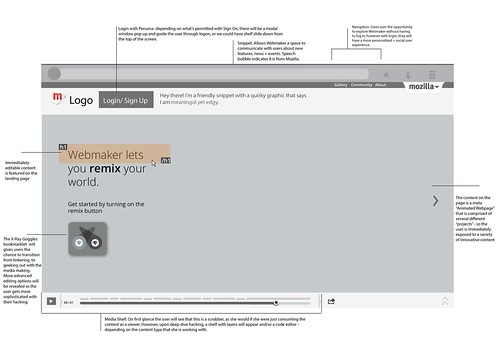
First,
lets take a look at the Landing page. The idea here is that from the
moment that you land on Webmaker.org you are given the call to action to
tinker and interact with content in a very real way. What you are
looking at is actually a meta "Animated webpage" project that is
comprised of several types of projects - so in essence the content type
becomes a gallery. The page is instantly hackable and as the user,
starts tinkering with an x-ray goggle like interaction- they can choose
to deep dive and reveal the more advanced editing tools. While this is a
mockup for the landing page - you could imagine that it is also a
prototype for how a user might be able to pull and view content from the
gallery - so the user gets the opportunity to digest a project first as
consumable content and then engage with it as a hackable medium. This kind of interaction was deeply inspired by my reading of the work of Mimi Ito - particularly in her book Hanging Out, Messing Around and Geeking Out. Here is what it might look like with some timely content.

The next mockup is a first iteration of what a gallery could look like for us. A user does not have to be logged in to view the gallery, but if they are they will have a more personalized lens as well as the chance to engage with the content creators.

In this mockup (which admittedly is the most nascent) you see a view of what a user might see if they are clicking on a particular users name - it's a filter of the content that the user made public. This could include their projects, badges or assets. Ideally this page will have some level of hackability - a la MySpace - so maybe the CSS of the page could eventually be modified by the individual users - since in essence this becomes a bit of a portfolio page. To be clear, I'm not saying it should look or feel like MySpace - but there was a certain level or ownership and creativity around that kind of personalization.
Finally, I'd like to share with you the prototype that I hacked up with Atul yesterday. It's a prototype, so you know don't tweet far and wide - but you can check it out to start to see what it would be like to have hackable content on a landing page and remember to click "D" for deep dive to bring that content directly into Thimble.