Friday, February 10, 2012

What the Heck is an MVP?


Often times on this blog I drop jargon bombs. Today's word of the day is "MVP". Now, although we know that the recipient of this award was Eli Manning at the 2012 Superbowl, in the product design world- it has a decidedly different meaning. MVP stands for Minimum Viable Product. If you check out wikipedia, you get this definition:
The minimum viable product is that version of a new product which allows a team to collect the maximum amount of validated learning about customers with the least effort.
Yeah it sounds a little bit,  marketing-talk-ish, for me- but what I like about it is that really, it speaks to the fact that we are creating a thing- that at the end of the day has a brand, a function and a user (among many other qualities). Some people actually say that MVP stands for minimum viable prototype- which has an interesting, subtle difference in meaning. Prototypes are a kind of a product, for sure, but saying and most importantly deciding that something is a prototype- an experiment - a test is liberating and I think speaks more directly to the kind of work that I am currently doing.

In What do Prototypes Prototype? Stephanie Houde and Charles Hill describe how prototypes can help to answer and explore different kinds of design problems. They discuss how prototypes help you to evolve your design concepts.
Selecting the focus of a prototype is the art of identifying the most important open design questions. If the artifact is to provide new functionality for users- and thus play a new role in their lives- the most important questions may concern exactly what the role should be and what features are needed to support it.
In this paper, they go on to say that a brick could be a prototype- if it answers a specific kind of design question- for example--- what will my product weigh?

So, why am I talking about this? As I have been blogging about here, here and here- we are in the middle of an Open News Design Sprint. We defined our "MVP" for the Open News sprint as something that has some level of functionality and gets our concept across. But really this is not so much an MVP as a prototype. We are not yet at the point where we are concerned about productizing our idea- so much as expressing that idea.

The concept for our prototype is that we can morph the lovebomb.me into a tool that will empower journalists and those with a passion for writing into learning a set of web literacies.  But what are the questions that we are asking and trying to explore with prototype? We actually have several- as the prototype has a few components:


The Riddler also comes up with good questions, well maybe not "good"
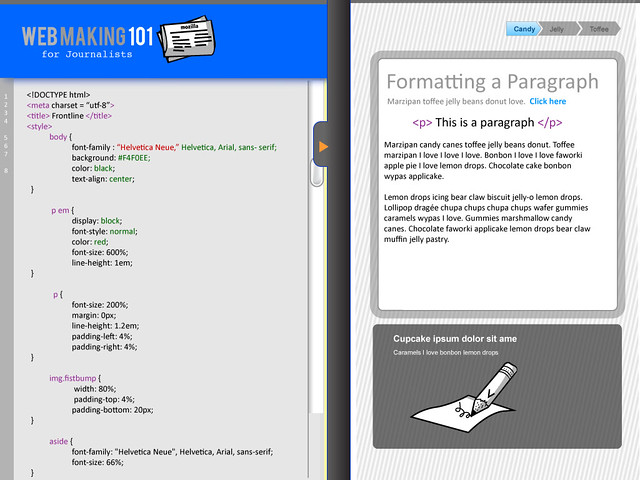
1. Is this concept of embedding learning by having users deconstruct and reconstruct their own stories actually a good way to learn html and css?
2. Is editing html and css with the help of a preview window and an instructional overlay the most effective interaction for engaging users with this content?

3. What kind of tool will appeal to journalists who have never written html?

4. What kind of tool will appeal to users who do not self identify as journalists?

5. How can we incentivize learning of html and css for users?
All of these questions generally fall into 2 categories of Houde and Hill's prototype models - role and implementation. As they describe:
Role refers to questions about the function that an artifact servers in a user's life- the way in which it is useful to them.

Implementation refers to questions about the techniques are components through which an artifact performs its function- the "nuts and bolts" of how it actually works.
The prototype that we create will respond to both role and implementation design questions. So, what we are currently creating? Our prototype includes:
  • a 2 page clickable site 
    • page 1- intro that lets you input a url for something that you have written online
    • page 2- a 3 panel page with the split editing window and the "instructional overlay
  • copywriting
    • landing page framing copy
    • instructional text explaining how to use the 3 different "windows"
    • explanatory text that explains techical things (for ex.: how to write a tag)
    • descriptive text for issuing badges
The prototype will not be pretty but it will serve its purpose and help us to answer our questions. Finally, as Dan Sinker pointed out - "building something forced us to think through the details." And really, that pushes foward our movement to ultimately one day getting to an MVP.


Wednesday, February 8, 2012

Open News Design Sprint Day 3: Meet the Journalists


After two days of doing a design sprint brainstorming about a tool that could help journalists learn webmaking, we decided to go right to the source for help. We invited about a dozen journalists to join us for a conversation today. We lucked out and got a fantastic group of professionals with a variety of different skill sets and backgrounds. Journalists showed up representing tons of different orgs, including: New York Times, Forbes, Gotham Schools, NYU Journalism Institute, Mashable, NYU ITP and the Huffington Post.


The main question that we asked this group was: "What do they you to make on the web?"We had a range of responses to this question.  There we are a lot of answers in the categories of data manipulation, data visualization, interactives, and text based interactives.
"There are two categories: a special project that's a one-off that blows people away and wins awards. But the thing that's more interesting are the things that can sustain and help a community. A database of property transfers that is maintained and is there for someone to access when they want to find out about it. Something that continues, is sustained, and is part of the fabric of info flow in a community. Data that comes in and continues to live." (note that all quotes in this post are paraphrased from the session)
We delved into an interesting conversation about what journalists need to know in terms of learning about the underpinnings of webmaking. Many participants talked about wanting to learn skills that actually fall into the category of "design thinking."
"Journalists don't have the knowledge of when to use a map vs not use a map. Or from a story to getting more interactive. They need to understand that a story isn't just an article, that it can be a whole bunch of different things. design thinking methodology"
"When you get down to it, we have a history of journalists as writers. But the last thing you want is a situation when all the journalists become coders. The more powerful thing is to have more of that process--the methodology/training/etc. To run a group of coders, or talk to coders. To know enough about your topic to come up with ideas and know if something is feasable or not. Not to be condescending, but 'skills are for interns' they are important to know to do, but nobody's going to make work-changing this just coding CSS. Skills are great and they're important, but it's about getting to understand the bigger picture. We spend a lot of time on, what do you call it, agile journalism."
I explained to the group that I personally have no interest in forcing anyone to learn how to code, but I was interested in learning about what would empower journalists to take an interest in webmaking.

"It's about showing them good work, and then showing them easy things--things that are very much within reach. It's about motivating them and liberating them."

"A big problem is internal. Which traffic cop gives the most tickets per parking meter: you dont' want to wait for six weeks for the data guys to come back to you with the answer. It's about being able to quickly test a hypothesis that could be interesting. There could be a story here--well, you want to know that quickly. Maybe the distribution of skills in the newsroom is 200 writers and 2 coders--it's going to be a long time before that. How much coding do you need to be able to play and test those hypothesis?"

"It's the bridge/demystification thing. There's a big wall--it feels like it. But then you go to hackjams and it feels attainable. It demystified it. When you realize those tools are attainable."

Mentorship and peer based learning was another topic that came up. One participant admitted to the group that he had signed up for CodeAcademy because of "social peer pressure" but then is now in the position where he has 6 untouched lessons in his inbox. This is because the great myth about something like CodeAcademy is that you are doing it with your friends. You signed up because your friends tweeted about it and you got all pumped up and signed up together- but then you are at home by yourself at the end of the day- not coding. Another participant talked about how she and a friend got a book and together followed all the steps to learn Python. After a month or so, they hired a "geek" to ask questions. We talked about how there are online communities for that like Stack Overflow or Quora- but these are often intimidating communities where a journalist would never think to go.

We asked for some initial feedback on the prototypes that we are working on. Here were some of their responses:

1) On the sequencing of learning content: Is the tag flashy enough to be the first thing that is taught in the instructional overlay?
  • some say yes, some say no. The yes came from a not super tech savy journalist "I don't want big blocks of text"

2)  On the editing window: I see a lot of use of the immediacy of the left/right pane as tool
  • everyone agrees
  • "there is no internal demo tool other than building the page

3) On if this is useful: Yes: even myself, on my Tumblr, if I want to make a change, etc, I have to publish it, look at it, reload, etc, that's incredibly frustrating.
  • A bigger use-case  for this is internal training, self training, etc. I'm throwing in on being the weekend home page editor.
4)  On Badges: I can totally see only entertaining resumes from people with that badge. And if you don't have it, spend a weekend to earn it. 
At the end of the session- Carl Lavin was generous enough to sit with me and tell me-- if we were going to do webmaking 201, 301 etc for journalists what topics would he want covered. He wrote out these cards for me:
I think these will be really useful when we start to build out learning pathways for our Mozilla learning offerings.
I spent a good deal of time picking the journalists brains as well about the topic that I have been struggling with this week- about framing this as a project about storytelling or something specifically for journalists- and many participants told me that they prefer the storytelling angle because it is something that can appeal to a larger audience. Some of the journalists told me that that "journalism" means different things to different people, but at the end of the day everyone has a story to tell. And that is something that I can bake into the prototype!


Tuesday, February 7, 2012

Day 2 of Open News Sprint- Design for Empathy vs. Pure Utility

Day 2 of the Open News Webmaking Design Sprint kicked off with a storyboarding session- which of course meant a round of the color coding index card game! Basically what we did was come up with three categories of things that we were sketching out the flow for:
  • Main Screens and Modal Windows (pink cards)
  • Content in the Instructional Overlay (orange cards)
  • Badges (green cards)
*Note- I will post the full storyboards later this week

One thing that was an interesting change from yesterday's conversation was that we converted the "sharing" steps into information that can be revealed and explored when the user clicks on the "share" button, thus eliminating that extra step. 

In terms of the badges, for simplicity we came up with one badge per each skill set. So, for example, in the image below- we sketched out 3 steps for learning about how to write the html for embedding an image into a webpage. Step 1- place an image that we give them, Step 2- hack that image with an unique image and Step 3- Remix that Image--- then the user will receive an Image Badge. Completion of all the Modules will give the user the "uber badge". (We need real names for these badges, but this is just a concept).
One thing that we talked about- which is out of scope for this pilot prototype- was having a user pledge for the badge by going through a series of interactive activities or games or questions... to prove their skill. It's a bigger idea that certainly relates back to integrating this badge into a larger spectrum of "Mozilla Badges," but I like this idea because on some level it proves competencies and could essentially allow users to skip other "intro" activities in courses or interactives.

Atul, Brian and I spent a bit of time trying to figure out how we were going to implement the designs into a working prototype, a small- yet crucial step. Good news, we think we can make something by the end of this week.

The group had a great conversation about metrics for the project that I think we will rehash again after we create the MVP (that's a minimum viable product not a most valuable player). This is what we came up with as a first stab:
  • Beyond-the-tool Metrics
    • How many people share their URL outside of the tool (twitter, blogs, etc.)
    • 3-months-later survey of people who graduated
  • Tool usage measurement metrics
    • How frequently the user switches away from the page (to another tab, app, etc) while using the app
    • How many steps people go through
    • How many of those steps are repeated
    • Time taken per step
    • How many people are return users to the website; so they use the tool and stop at a certain step and then come back at a later date to continue
    • and what are those stop points?
    • Also, how many people graduate from the 'course' (tricycle) to the 'tool' (training wheels), ie. how many people turn off the overlay and keep coming back, how many times.
    • How many people do the bare minimum (just the tutorial)
    • What link text people use when writing links and how many links are they putting in
    • How many people come back to pledge for the full badge?
    • How many people go above and beyond with tinkering 
      • i.e multiple images, all the "optional" styles, etc.    

We spent the remainder of our jam packed day focusing on copywriting. We had a conceptual conversation about what direction the tool should take, which of course affected the way that we wrote the copy. Because we couldn't agree on whether this should be a generic webmaking 101 tool, a tool focused on helping people tell their story through the web or a tool geared towards journalists we decided to write as much of the technical bits and pieces as possible and to come back and add on the layer that included narrative, voice and character.

Today I am feeling a bit conflicted about the design direction. In my heart I believe that the project should be a self directed interest based learning tool- which means a tool that helps someone make something and then baking in the learning seamlessly. I am concerned that if we go too generic we will end up with a tool, that people can't relate to and thus won't feel compelled to deep dive into the learning content. So that said, I guess this just is about deciding between the "telling your story" vs. "webmaking for journalists 101". As I said before, I like the telling your story through the web angle for the product because it is something that is easy for many different kinds of users to relate to.  This is about branding- and by branding I don't mean slapping a logo on the project and calling it a day- it is about creating a narrative for the project that is compelling enough to give users and potential users the opportunity to empathize and relate to the project on a deeper level. 

For example- if the lovebomb.me experimental project was a tool it might be called something like e-card maker. I suspect that people would not have responded so strongly to that project. We built in a narrative and a real directive- make a love letter for a friend- and wrapped that into a light narrative heavily supported by cute lovey-dovey graphics.  Well, this conversation is to be continued later.

Tomorrow we will be meeting real live journalists, so I am excited to ask them about what they really are interested in making with the web. Hopefully this will inform the direction of the project.

Monday, February 6, 2012

Storytelling- Day One of Design Sprint "Webmaking for Journalists"

Today was the first day of the Open News - Webmaking 101 design sprint. Thanks to Hive NYC member Peoples Production House for graciously volunteering to host us! The team for our sprint includes:


pictured: erin knight, chris lawrence, michelle levesque, dan sinker, atul varma, brian brennan, jess klein and mark surman (not included are some top secret special guests who shall be named later this week!)

We started the day airing out our joint concerns about the direction of the project. It turns out, I wasn't the only one who was concerned about the tool not making sense within the range of potential tools that we might be developing at Mozilla. We all discussed what a journalist would want to make- and agreed that a journalist would want to use the web to tell their story. While this might sound simplistic, this is a topic that I am much more comfortable developing a project around compared to something like Webmaking 101 for Journalists. As I talked about in my last post, here is an example of a potential user who has a deep interest and motivation to make something (a story) using the web- and thus there is the opportunity to embed learning into this moment. Also, I think that the idea of storytelling has the potential to reach different kinds of learners (although it could certainly appeal to journalists)- including filmmakers, poets, youth etc.
We came up with a few goals for the week, including:
  • create a dirty working prototype- it doesn't have to be pretty, just having some functionality
  • designing some badges for the prototype
After determining our goals, we set to work reviewing the learning objectives for the project. This is a key thing for us to to review, because we wanted to make sure that the project fell within the scope of web literacies that are being defined for Mozilla.  We had a good conversation about what could be included and what was out of scope for the project. Here is a little venn diagram that shows the domains within Mozilla's web literacies that this particular project will be addressing.

Essentially, there are 6 clusters/modules/ steps that we will be exploring through this exercise in helping people to tell their story through the web (below). While we will offer the skills in a series, ideally the user will have the opportunity to take these modules out of any particular sequence.
  1. All about Tags
  2. Style Your Stuff
  3. Images
  4. Links and the Open Web
  5. Embedding and Beyond
  6. Sharing
In our first brainstorm, we discussed using these 6 modules as guides for badge distribution within the context of the prototype.

Tomorrow we will be mapping these modules and learning objectives to storyboards for the instructional overlays and starting to work on developing out the content and copy for that section. I am really excited with the direction that this project is going and with our re-envisioning of the learning objectives as well as scope.


On Integrating Learning

Over this past weekend I went to an exhibition at the Brooklyn Museum of Art called Hide and Seek- it was a fantastic show exhibiting American work focusing on gender and identity. I highly recommend it. However, as I was going around the exhibition, I came upon this sign:


The sign marked the entry to a room devoted to didactic content related to the themes and subject matter in the exhibition. While normally I am such a huge fan of how innovative and creative the Brooklyn Museum is with providing interactive and accessible learning tools in their exhibition spaces, I was a bit put off by this. First of all, no one was entering this space (except my colleague Atul- who I think falls under that small percentage of self proclaimed "information geeks"). I don't think that seeing the words "Educational Resource Space" would compel anyone to enter that area.  The exhibition had extraordinary content with the lush and often times shockingly graphic art and photography- why didn't they exploit the opportunity right then and there? Yes, there were the typical didactic labels filled with tombstone information- however that kind of just scratched the surface of the potential conversation.

This experience got me to thinking a bit about the work that I am doing at Mozilla. As I've said numerous times, I am not about hiding the learning or sugar coating it- but I am interested in integrating it into the activity that the participant and, in this case "viewer" is passionate about. When we build software and tools- we should be thinking about how we can embed the learning into the experience and not make it something that you need to seek out as an afterthought. This is important for many reasons- but on a very practical level the reason to do this is because you have a captive audience!

As I keep iterating on my prototypes and participate in the Open News sprint this week- I am going to try to keep this in mind. But, it is something that Mozilla is committed to, by design. By design, people like Atul and I work on the same team- and we work with community members who are skilled in teaching and education. We have embedded the learning in our work structure, but now we need to constantly keep ourselves in check that "learning" is not something that happens just in a special space in our projects that is devoted to "educational resources."

Friday, February 3, 2012

Instructional Overlay for Webmaking 101 tool prototypes

In preparation for the Open News design sprint next week I did a few mock ups playing around with an Instructional overlay. The idea is that this is a slider that could be toggled over the js.bin interface that we use in the lovebomb.me, webpage maker and soon- open news prototypes. It will give the user helpful tips and pointers on how to write html and css.

As you look at these designs, keep in mind that the grey bar can be moved up and down (or side to side) with your mouse.

This first iteration is a horizontal overlay. My concern here is that if a user has a small screen it might be cluttered. Additionally, I am not sure if this is the most logical design for a user who will probably have to go back and forth editing the html and reading the instructions.  The numbers 1- 5 are a progress bar. I am not convinced that this is the best placement or if this is appropriate. I think that once we think through how badges might be integrated into this prototype, the progress bar will be reconsidered. (Note: all language and branding graphics are place holders)


Below is the second iteration- I am trying out a vertical overlay.  I think that this feels a little bit more logical and intuitive in terms of design. I also changed up the progress bar a bit and the slider toggle.

vertical instructional overlay

I was having a bit of a prototyping party testing out some different ideas for progress bars below. Also- playing around with potential palette options. Such a small detail can really structure the entire learning experience- as well as infuse a little piece of personality into the design.

We will be having the design sprint next week in Brooklyn. I am excited to really dig into the project and to think a bit further about the question- "what do journalists want to use the web to make- and how can we help them do that?"  We will be exploring if these designs are useful for the project. I'm not really concerned if they aren't because we can actually use them on the lovebomb.me experiment.