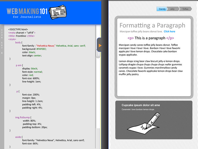
As you look at these designs, keep in mind that the grey bar can be moved up and down (or side to side) with your mouse.
This first iteration is a horizontal overlay. My concern here is that if a user has a small screen it might be cluttered. Additionally, I am not sure if this is the most logical design for a user who will probably have to go back and forth editing the html and reading the instructions. The numbers 1- 5 are a progress bar. I am not convinced that this is the best placement or if this is appropriate. I think that once we think through how badges might be integrated into this prototype, the progress bar will be reconsidered. (Note: all language and branding graphics are place holders)

Below is the second iteration- I am trying out a vertical overlay. I think that this feels a little bit more logical and intuitive in terms of design. I also changed up the progress bar a bit and the slider toggle.
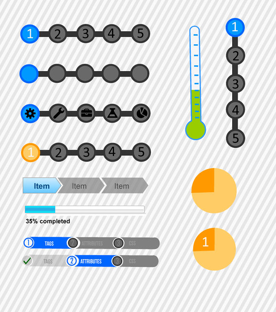
I was having a bit of a prototyping party testing out some different ideas for progress bars below. Also- playing around with potential palette options. Such a small detail can really structure the entire learning experience- as well as infuse a little piece of personality into the design.
We will be having the design sprint next week in Brooklyn. I am excited to really dig into the project and to think a bit further about the question- "what do journalists want to use the web to make- and how can we help them do that?" We will be exploring if these designs are useful for the project. I'm not really concerned if they aren't because we can actually use them on the lovebomb.me experiment.