Friday, March 30, 2012

What's in a designer 's bookbag?

what's in my bag?From left to right: Reading materials, Grow a Game, Grapes, Laptop, Wacom tablette, laptop cleaners, pens, makers, pencils, dice, pencil case, scissors, sketchbooks, dongles, surge protector, ipod shuffle, index cards

At a recent workshop that I gave for a bunch of teenagers,  I was asked "what does a designer have in their bookbag?" by one of the participants. At first I thought it was a funny question and thought - obviously... metrocards, wallet etc. But after a little bit of  discussion, I dumped out my bookbag and watched the teens dissect my stuff.

The first things that they grabbed for (in order) were: my sketchbooks, my Wacom, my laptop, my books.

Although this was a casual interaction , it got me to thinking about a few things:

I am not just Jess, I am "Jess the Designer" 

This might be a silly point, but I realize that I represent some level of a career path that a teen could choose to take. So when they ask to see what's inside a designers bag, they are asking what it's really like to be a designer. They are curious about what putting on that "hat" or in this case, wearing that bag, would really be like.

Tools are personal

Everyone is intrigued by gadgets, but tools are personal. I found it intriguing that these teens who are passionate about technology first grabbed for my sketchbooks. They knew what they were going to find in there, my scribbles- plain ordinary books but they went for it. I think that like me, they crave something tangible. I like having accessible tools- since I design with community members and for participation, I try to have with me things that anyone can just pick up and use- that's why I have index cards, hello kitty markers, dice and paper. The teens asked me if everyone uses macs, or androids (my phone-  not pictured) and I told them that it was just what I used. I've talked about this before, but I am pretty agnostic about my tools: I use Adobe Photoshop and Aviary, I use a little of everything- and I like it that way.

Showing your bag is an extension of showing your process

At Mozilla, and just in general- the way that I work is called, "working in the open." I share the majority of my process- from sketches to interactive final deliverables. I think that sharing what you work with and how you work is just as valuable as the end product. Why? I value the experience and the craft of making something. Much of my stuff is made for the web, but that doesn't mean that I make it all on and with the web, I take my real-life personal and local world and experiences and bring that into my work.

What do YOU have in your bag? How do you share your process with your community?

Wednesday, March 28, 2012

How One Girl is Changing the Web


Zainab says it best:
"The Mozilla Hackasaurus workshop was a once in a lifetime experience."

From X-ray Goggles to Hack Jams, Mozilla is giving kids the tools to remix and shape the Web — moving them away from consuming what already exists and toward shaping and building a more awesome Web — and I'm thrilled to be a part of it!

Projects like Hackasaurus are helping to create a generation of Webmakers — and today I want to introduce you to Zainab Oni, an extraordinary 15-year-old who is not just remixing the Web, but is teaching other kids how to remake it into anything they want it to be.

Zainab is a sophomore at Hudson High School of Learning Technologies in New York, where she serves on the school's MOUSE Squad — a student-led technical support team that's part of a national program to help improve technology literacy skills. She's also a rising star in the world of hacking — something she recently discovered meant a whole lot more than just "snooping around."

Through a project led by Mozilla's Hive Learning Network in New York, we held some Hackasaurus workshops at MOUSE headquarters, and it was there that Zainab's understanding of the Web began to transform. Hackasaurus opened the door to a whole new way of thinking about the Web for Zainab, simply by exposing her to how she could create and change it. Now, as a Mozilla Youth Ambassador, she'll be taking everything she's learned to help facilitate Hack Jams with her peers at after-school programs later this year using Mozilla tools.

Take a minute and check out Hackasaurus to find out why it's changing the way Zainab thinks about the Web.

The online experience presented to most kids today is one that is delivered in a shiny, fixed package — but Mozilla is changing that. Just ask Zainab:

"We were introduced to Hackasaurus, a tool that makes it easy to mash up and change any website with the use of X-ray Goggles. You can remix any website and change it up to become your own...it was new and exciting."

When we launched Hackasaurus in beta, I saw kids eagerly interacting with the tools — and challenging each other in "Hack Battles," a super cool prototype we developed at last year's Mozilla festival — and I knew we had to grow this project and get it into the hands of even more kids.

And thanks to Mozillians like you, we are developing a summer campaign around learning and making. We'll be reaching out to folks of all ages and inviting them to take part in creating really cool stuff on the Web. And they'll get the opportunity to see what others are making across the globe and even the chance to hack each other's coded creations.

We're still putting the finishing touches on our summer plans — but you can sign up here and we'll keep you updated.

Giving everyone the power to remix, make, and share the Web is something we are committed to. Thank you for being a part of it.

Monday, March 26, 2012

Friday, March 23, 2012

Love bomb Mock Ups

Here are some mock ups I've made for the Mother's Day lovebomb. All of the copy, of course needs writing.. but this is the general idea.

mothersday

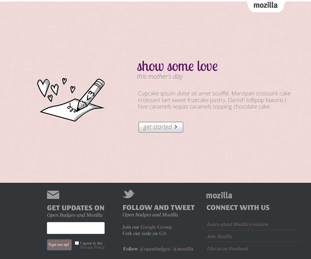
Landing page- I am not sure about this graphic.... or any of the copy. I think that I might revisit the graphic and possibly include a kid or something holding a "webpage" like a card. 

stepone
Step one: here's the templates. I cut it down to 6. (These templates might not actually be the final contenders) I tried to make the "steps" pages feel really clean so that if needed, in the future, this  could be re-purposed.

mothers-step2-v2
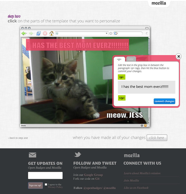
Step two- here the fun begins! I added in a mini browser view so that users can see that this is actually something that happens on a webpage. This mockup is as if a user has clicked on the text block and a widget will pop up to allow for editing. The widget is tabbed here so that a user can remix both the text as well as the color.

mothers-step2a-v2
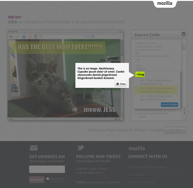
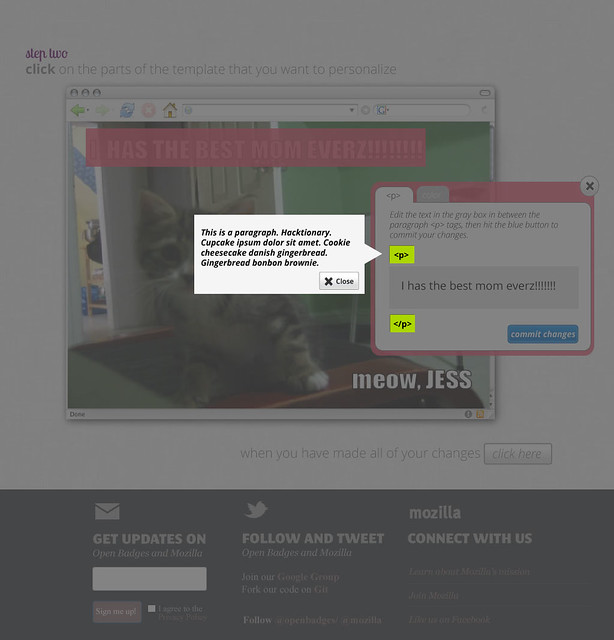
If you click on the html tags- (here the paragraph  tag) the whole page will ghost and the hacktionary definition will pop up.

mothers-step3

Step 3: share page. The icons are for : twitter, mail, the url and grabbing the html code- I'm not actually sure if those are the right options- need to check in with the Engagement team on that one. As I look at the mock up here... I think that I need to move the graphic of the website up a few pixels- and also move the phat footer down a few pixels. I am trying to keep this page as simple as possible. I am wondering if there's some pre-determined text that mozilla can create for the tweets... and the emails.

First stab. A lot of iteration already is going on here, which you can see if you check out my Flickr stream.

Wednesday, March 21, 2012

but wait, there's MORE!

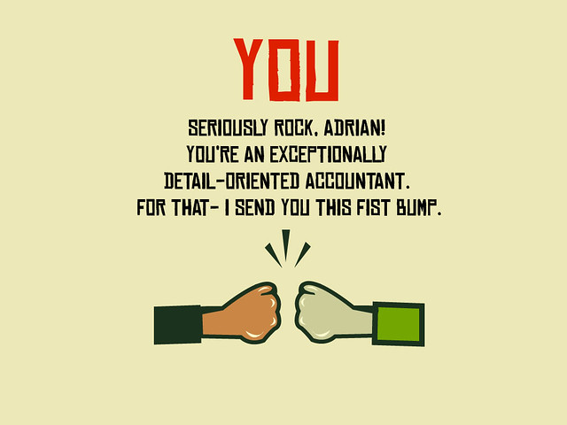
Here are a few more generic templates for the lovebomb project. A call to action, A fist bump- slightly revised and the masked lover- slightly revised from previous iterations.


fistbump

soapbox2
mask

Tuesday, March 20, 2012

Lovebomb templates

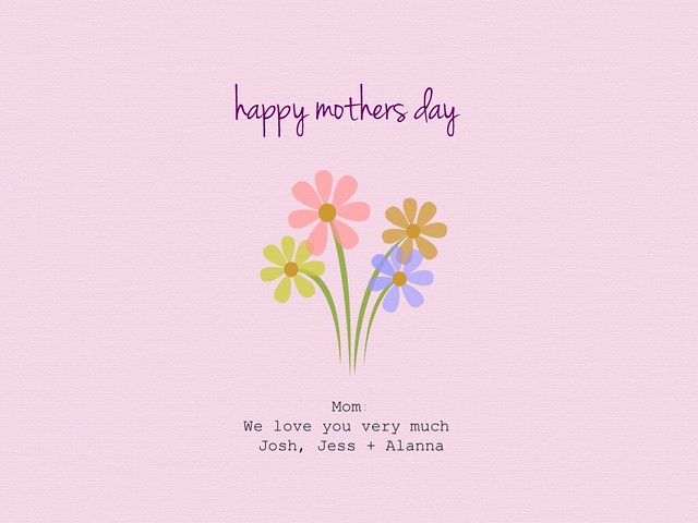
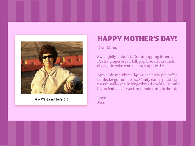
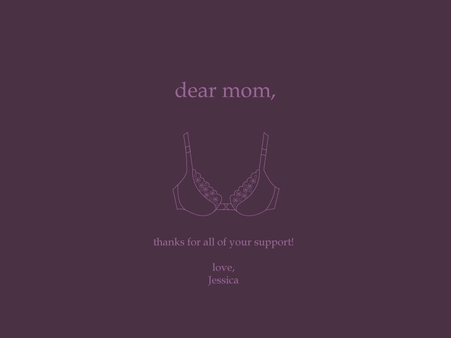
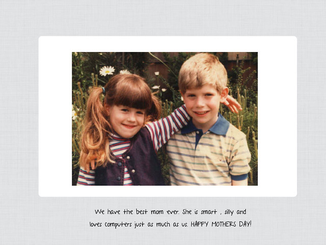
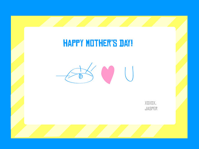
I'm working on some Mother's Day themed templates for lovebomb. Here's what I've got so far:

mothersday1
mothersday3 mothers4 mothers5 mothersday2  eyeheartu

Monday, March 12, 2012

On the road again

I recently started running again. I haven't really, truly been diligent about running in about 14 years! I am a bit scared that I am not going to be able to do this. I am starting out a bit slowly, 3 times a week. My goal for this month is to run 12 times. That doesn't sound like a lot, but for me it is a huge goal.

Part of the reason that I am doing this is because I am very much out of shape and uncomfortable with my body right now, but part of this is to prove to myself that I can do this. Over the past few years with my changing career paths and moving around and such I feel like I have lost my confidence in things. I hope to be able to use this as an opportunity to rebuild. I am hoping that in 8 weeks from now I am going to be confidently running a 5k.

Friday, March 9, 2012

Yo Momma is da Bomb

So, I am back on working on the Mother's Day campaign for the lovebomb. I originally didn't want to work on this project because I felt that the project had too little learning involved and that we were essentially starting the user off in a sandboxed environment. We made some  changes and I think that now it might be an acceptable low hanging fruit way to get started with playing around with HTML.   Here's the low down:

CONCEPT
The concept is to create a tool for individual and collaborative letter sharing and storytelling. The project is entirely web-based, in which participants remix templates to express their love and sentiments for mothers and friends, in turn learning some very basic HTML and CSS in the process.


WHAT IS IT?
  • A method of building webpages from templates
  • A narrative experience
  • A publishing platform combined with broadcasting capabilities
  • A learning tool- like bumper bowling for making simple webpages
WHY?

1) Provide an approachable, fun on-ramp into our learning offerings
2) Teach a little bit of code, without being too intimidating for a n00b
3) Grow our base of supporters
4) Create a unique method of narrative discourse


PRECEDENTS


Lovebomb.me - obviously this is the first iteration of the tool.
What's working: emotional design, people immediately "got it", Fun templates
What's not: not enough guiding, you need to enter the tool with a certain comfort level with code.


Webpage Maker- this was actually a pre-cursor to the lovebomb. The idea behind this was to provide a stepping stone for users who excelled in Remixing webpages to move closer to more concrete webmaking.
What's working: Simple design, templates, split screen view
What's not:  No instructional overlay or any hints in the templates html/ css to guide users


E-card sites: Jib Jab, Blue Mountain cards, etc.
What's working: Some level of remixing, personalization and sharing
What's not: Not truly collaborative, and not digging into how the web page was made.


2 panel editors: jsbin, jsfiddle htmlpad etc.
What's working: super clean design, easy to see what you write vs. what's goin on the web
What's not: no specific projects that are coming out of it or element of learning


DESIGN QUESTIONS
  • What kind of learning experience is a user gaining by being subtly being introduced to writing code this way?
  • How is the tool given new meaning by layering on Mother's Day content?
  • How can this experience feel authentic while being embedded in an engagement initiative?
  • What approach is required for on-boarding a non-coder into engaging with the underpinnings of the web?


AUDIENCE

This is a tool for non- coders. People who came to the site either through Join Mozilla or other engagement channels. I am designing this tool in such a way that it can be used by adults or youth. Unlike Hackasaurus tools, youth are not the primary target.


MOCK UPS


I haven't picked up from where I last left off on the tool mockups, but I did sketch a few ideas for templates:


A super simple, sweet card. Serif/ handwritten font

a little silly


 customizable (x= area to insert cute image of mom)

I haz the best mom (photo takes up background) a la I haz cheezburger


The timeline on this is super tight- so I will post as much as I can while I'm thinking through and sprinting.


Wednesday, March 7, 2012

Think Global, Webmake Local

Recently, Mark Surman (Executive Director of Mozilla Foundation, innovator, cool guy + my boss) recommended that I listen to this Spark podcast featuring an interview with Angel Gambino, who is the co-founder of Rosa Parks- an exciting plan to re-vitalize the neighborhood of Corktown in Detroit.

In the podcast she describes designing a creative hub and what physical communities can learn from online community-building. At the very beginning of the interview she says that Corktown is a " interesting mix of different communities in one neighborhood" and goes on to say that it has "magnificent buildings and no people." Coming from Rockaway Beach, New York, a neighborhood that also fits this description quite perfectly, I was quite taken by the project and the passion that Angel Gambino has for neighborhood renewal. In the conversation she discusses how her skills in online community development translate into activating physical communities. This is a passion that I share. In graduate school, I worked closely with the Rockaway Waterfront Alliance and the Swim Strong Foundation- designing interactive tools to build community awareness and activism around beach safety. While the two projects are obviously quite different in scale, at their core is design spaces that encourage collaboration notably combined with a grass roots LOCAL call to action.

This is me user testing my thesis at the Rockaway Beach earth day festival several years back


Now, if you follow my blog, I am sure you are connecting the dots and seeing the natural connection to the work that I do at Mozilla.  In the online melting pot that is the Web, you naturally have a plethora of communities given the opportunity to collaborate. However, I think that something is kind of missing when we (Mozilla) usually talk about our mission. We discuss our desire to "build the next generation of webmakers" - but really, the crux of that statement is in the word "webmakers". Web Makers - someone who is using the web to make stuff. Sounds obvious? Wrong. This is not obvious. A very small percentage of the schools, libraries, community centers, adults and youth who I work with in and outside of Mozilla actually use the web to make stuff. The web is a place to make things happen, to convene, to organize and distribute information- but the idea of making something is a real call to action! 

Why would you want to make something with the web? I think of my mother, Rose. She is a retired New York public school teacher who is passionate about community development in the real true sense of the word. She has taken it upon herself to learn how to design a website and a facebook group for some of the various organizations in Rockaway that she volunteers for. She makes things on the web and with the web- because she knows that people in her community are of a certain age and aren't running to face to face meetings, but she also knows that her community values those face to face meetings. My mom meets people where they are- and designs spaces for collaboration within the appropriate medium. Because she is a designer of the web, as a webmaker- she is making a mark for how her own community is represented in the virtual and global world, and she is doing on a local level that makes ripples of impact.

 This is my mom, volunteering at one of my hack jams in Rockaway Beach

As Mozilla moves forward with its development of projects such as Hive NYC and its online learning offering in Hackasaurus- it is really thinking about how to build up and support local webmaking, engagement and activism through events, programming and open source resources. The goal is not to build Mozilla's vision for the next generation of webmakers- but for the next generation of webmakers to design their vision for their own local and personal world and ecosystems within the canvas that is the Web.

Remember that the web is a hand made thing, designed by individuals- and without individuals representing and defining themselves within this worldwide online community, the world is essentially missing their voice in the conversation and decision- making that happens in this space. I challenge you, reader, to take action in your community. Make local change and impact by making the web!

Website Refresh: openbadges.org

Last week I worked with the Open Badges team to refresh the openbadges.org site. I came into the project about 2 weeks prior to the launch, so there were some seeds of ideas to work from- mainly due to the work of Erin Knight, Carla Casilli and Sunny Lee, however some of the things that I worked on include:
  • A new, clean and streamlined look and feel
  • Many new assets including character illustrations
  • Direct entry points for various constituents
  • A slideshow and quiz that educates you about badges and then gives you a chance to earn a badge 
  • A pathway to push the badge to your Backpack and check out all the features
The launch was timed to coincide with the Digital Media and Learning conference, which gave me the unique opportunity to design the site and then immediately watch tons and tons of users try it out and respond. Obviously users immediately responded to the design, because they were used to something that looks sorta like this:


and got this:


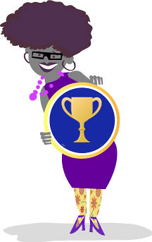
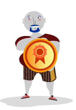
Since the site was very content heavy- I tried to create illustrations  that where whimsical but fairly clean. I will say that we did add some fun little animations to the project just to spice things up a little. Gladis, the name of the character on the landing page actually wiggles after about 20 seconds for example and the badges actually scale up on hover. We did this to infuse some sense of play into the work. With the characters, I was ultimately trying to have each character embody the identity for the pathway to engagement with the site: an issuer, user and displayer. I did a ton of illustrations  and work for the site- but  here are the character illustrations:


gladis                         borismortydorothy 


Another feature to the site is taking a quiz to earn your first badge. To do this, we designed a modal window that would allow a user to get a brief schooling in badges-- get the ironic pun? This is something that definitely needs to be iterated on some more to be a bit more of an authentic experience- but hey, we are Mozilla and we iterate in the open.


Since I came into the project as a bit of a special forces unit, I am probably not going to be too involved with this work in the future- but I really had a fantastic time working on it and being part of a bigger team. Big shout out also goes to Mike Larsson who worked closely with me on coding and helped make  decisions about the design direction. And of course- Brian Brennan, Atul Varma and Chris McAvoy helped us to iterate and pushed the project forward.

Monday, March 5, 2012

Storytelling with Events

Often times we talk about "Mozilla community members" as volunteers or interns- but really, they are much more. While there are only three or four staff on most of the projects that I am developing, there are often a minimum of a dozen contributors who are truly user testing, designing, localizing and building each tool. These are teenagers, designers, educators, engineers and people who are just truly passionate about Mozilla's core mission to build the next generation of webmakers. Community members- take time out of their regular lives every week to feedback and push the project to new limits.

Last week I had the opportunity to participate in a three day sprint on developing unifying resources for Mozilla's distributed community of webmakers who organize events. While we spent most of our sprint trying to think of tangible ways for people to be inspired, connect to Mozilla's webmaking philosophy and make cool stuff,  at the end of the sprint, ultimately it came down to thinking about the members of the Mozilla community.

I took the opportunity to channel the community members who make my work successful. It's their stories and actions within their local communities that are helping to make a difference and spread the ethos of the open web. Sometimes that is just a father sitting at a kitchen table with his son and his two friends trying to figure out how to make a webby video. It's these kinds of moments that are authentic and quite possibly spark a continued interest in collaboratively making things on the web. So when sat down with my colleagues and brainstormed the look and feel wireframes for the event site, instead of merely conveying information about events that people could find useful - I tried to unfold the stories behind the events, because ultimately, stories are memorable- and in the words of one of my favorite storytellers: 

"The power of the anecdote is so great that no matter how boring the material is... it has a momentum in and of itself "
- Ira Glass
So, here is my first stab at the front page wires:
Event Site Mock Up 

The idea here is that the entire page is kind of a slideshow. When a user touches the words on the navigation- the whole page shifts. There is of course some potential here for another overlay which can delve deeper into the story a bit more. (The photos are just place holder)
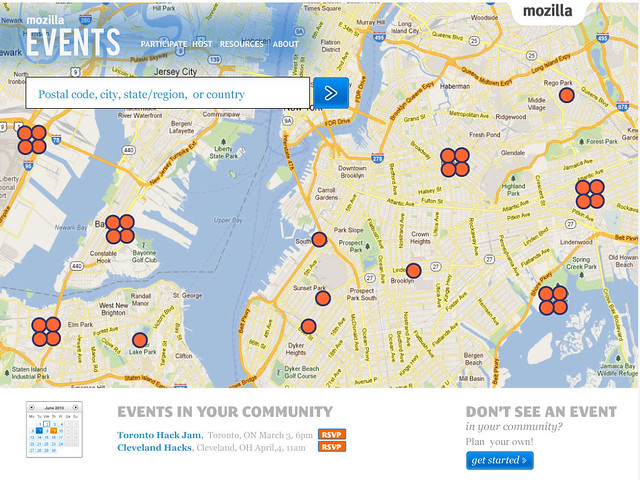
Event Map Mockup This second mockup is of the event finder- here you have the chance to locate events happening in your community.  The map will geolocate to your specific part of the world and then you can fine tune to find more events in your community.

I was quite inspired by some other orgs that take advantage of the power of storytelling including: Tupperware, Ikea, 350.org and the Obama campaign site.

The idea behind all of this is that once your feel empathy for the stories, and feel motivated to participate in this webmaking movement- then we will help you to connect to resources that will support that kind of learning.

For more detailed information on the event kit, please read my colleague Ben Simon's informative blogpost on Moving forward with distributed events  and Michelle Thorne's post,ti tled "The Mullet"