Monday, December 2, 2013

Brainstorming on Dashboards

During the summer, I spent some time thinking about badge directories and dashboards. The general idea was to prototype a tool for badge earners to make sense of the larger badge ecosystem and in turn to create an integrated dashboard that would help them to collect, maintain and analyze their personal data on their learning, goals and skill acquisition.

Initially I had come up with a few ideas for this dashboard:

a. focusing and personalizing skill search. Here, the user might type in skills that are of interest to them and then popular badges would appear. I like exploring the interaction of incorporating some narrative elements into this framework. Here, instead of just a search box - you have a statement of intent. 
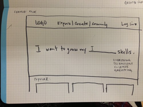
-1 


b. pathways focused -  This mock up lays out skills you already have and then upon click/hover you can see where your skills could lead you. This is personalized approach, so once you log in, it will display a visualization of skills that relate to your data. However, if you are not logged in, it could display popular or trending skills or even .. geolocate badges based on your location.


-2 

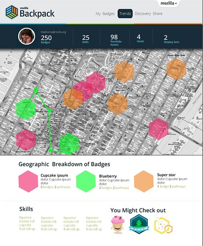
c. Toggle vision - this gives you the chance to explore what is available in the ecosystem as well as in your personal badge library - as a list, as a visual display, and on a map.
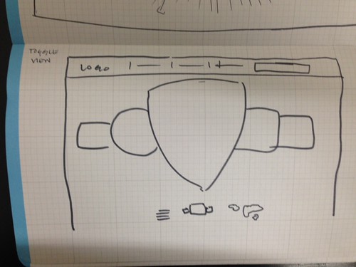
-3 

d. Whimsical Exploration - still playing with the theme of exploration, discovery and happenstance - this is kind of like a wheel of fortune. Each node coming out of the circle lists skills and then if you are logged in and in fact have the skill, it will be notated. There is a natural progression from this view to a more sophisticated learning pathways exploration. 
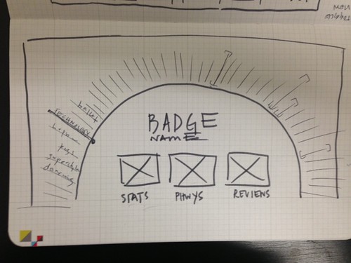
-4 


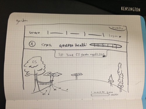
e. Your (data) garden - This one is a little crazy - but imagine that all of the trees below represent your skills at different stages of growth. You can have "community" gardens as well as "secret gardens" - giving you the ability to curate what data you are in fact sharing. Here you can also set goals, be informed about your "garden health" - which might just equate to giving feedback on various goals that you have set up for yourself - and tool tips - which could be mentorship or coaching based on your goals. There's a lot of metaphor going on here and it probably would be a brain game to figure out how to design it .... but this is just a sketch, so wha ha ha haaaa.

-5 


So - the Summer came and went and I thought about these prototypets a little bit more. More specifically, I started to consider what a dashboard and a discovery feature would mean in the context of something like BadgeKit. The goals of the dashboard, by nature would change to accommodate an issuer (as opposed to an earner). I think that these explorations are still totally valid and even hackable to modify for this new lens. Some of the goals for the user might include:
  • keeping track of the badges that they are offering
  • getting notifications regarding badge assessment needs
  • analyzing trends for badge earners. 
  • sharing rights for admin functionality. 

While I push forward on the thinking some more - I was reminded of the video, the Powers of Ten, when thinking about the display of badge data and badge ecosystem information. Upon first glance, a user might want a 1000 ft view of their world, but perhaps they want the ability to easily navigate back and forth through the level of detail that their data could be providing. Maybe an issuer only wants to view their goals, or their assessments - but perhaps they want to see trends, data about individual badges, and individual users. Maybe an issuer wants to connect their data to algorithms... the possibilities are endless!   Will update as we start to think about this more.

Thursday, November 21, 2013

Rethinking the Annual Review Self Evaluation

Every year I have to do an annual review - where I meet with my manager and discuss my performance over the course of the past year. Usually these reviews require me to respond to some sort of questionnaire about my work - with questions kinda like these:

List the projects that you worked on?
Which project are you the most proud of?
How can you improve?
  
For my last review, I felt inspired to switch up my submission to my manager and handed her this instead of the traditional q and a response form:
jessklein-birthday
My manager, Erin Knight, responded to it well and was able to ask me relevant questions based on the things that I chose to highlight. This year I was going to take it up a notch and make this an interactive experience. As I started to think about how to go about this work.

The first thing that I did was create a list in Evernote of all of my work:


Then I started to think about if this was going to be interactive - where would I link out to my work. This helped me to realize that I have my work documented in several places online, including: this blog, flickr and github. This lead me to an a-ha moment. I had skills that I wanted to show off, evidence to back up that I did in fact earn or enhance those skills and... I had a peer reviewer to potentially endorse me. Are you following me here? BADGES!

What I imagining here is a re-envisioning of the self evaluation. Instead of thinking about this as an evaluation - you can imagine this being a tool to help to uncover what you have learned over the course of the year and how you could potentially further your learning moving forwards. I am proposing a tool where I can self issue badges, with evidence and have those badges endorsed by my peer. A more complex version of this would integrate career pathways and mentorship opportunities - as well as a recommendation system.

Here is my first sketch on this idea:


Thinking to be continued.....

Saturday, November 16, 2013

MentorN00b : matchmaker matchmaker make me a match!

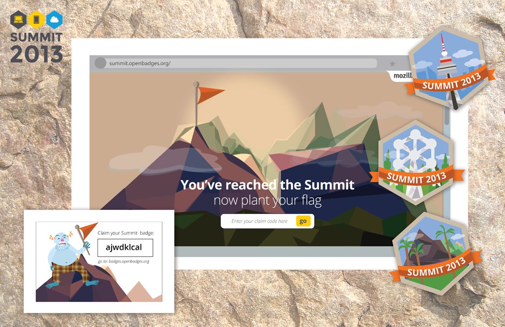
I have been doing a lot of little projects for one off events lately.  Like this badge claim page I made for the recent Mozilla Summit:

summitsuite 

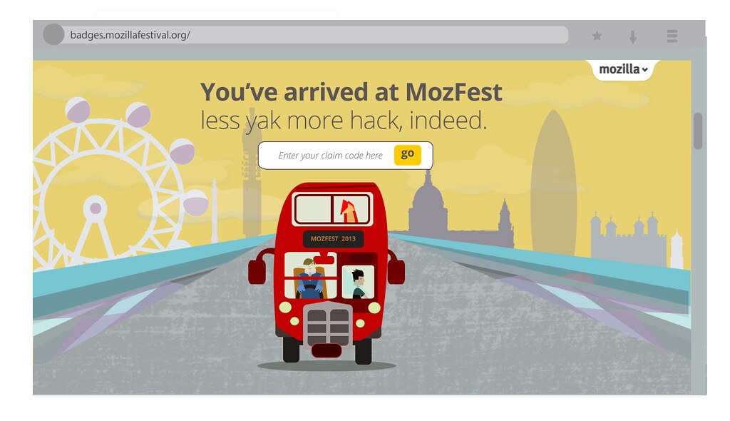
Or the one that I made for Mozilla Festival:
draft 
Usually we try to make one - offs more meaningful by actually doing some iteration on them or using them as a use case to inform the core product that we are actually working on.  So for example, I will probably work with our development and design team to figure out how to incorporate these kinds of claim pages into BadgeKit and will use the feedback that we got by standing and watching hundreds of people "test" out the sites as a usertesting and research exercise.

For these two events we also made something that I would put in the category of "schwag". Which, yeah - can totally be fun to make, but kind of usually feels a little meaningless. Here are the buttons that my teammates Chloe and Emily and I made for the events to help people to get interested in Open Badges:


This exercise, (I have to admit - quite surprisingly) turned out to be a meaningful design exploration that keeps on giving to us things to think about on the badges project. As Emily explains in her blogpost, the badges took on another life in practice. People hacked them and used them to give peers a glimpse of their identity - but not just identity with a capital I - really a deeper, more nuanced thing - how people self identify.

One day, I was in a coffee shop with Atul and Mike - thinking about the badges schwag and we were kind of doing our usual brainstorm of - wouldn't it be cool if ..... - and we came up with an idea for a prototype that could have pretty tight parameters. I would categorize this as a prototype that's not designed to scale. 

What we realized was - that at these events we would be seeing people with different kinds of expertise and desires and how in a perfect world we would match-make button wearer's so they could help each other out to learn skills. So for example, my button said that I was a javascript n00b and if Mike's button said that he was a javascript nin.ja we could be paired together.


What the three of us started to hack on was an app - where people could sign in, state their interests and then get paired with a like-minded friend to help mentorship. I could imagine this being something that could be taken further - so after a match is made, a mentor could help a n00b to develop a learning map/goal or trajectory and suggest or create badges for the n00b to work towards. Using the tools offered in BadgeKit, the mentors could then provide peer assessment for the n00bs. Additionally, the feedback loop could be closed by the n00b then giving the mentor through various kinds of mentor badges. This would in essence develop a mentor - n00b community and give participants the ability to always identify as somewhere on the spectrum for different skills or activities as mentors and/or n00bs. I particularly like this idea - that someone could be a mentor and a n00b at the exact same time. 

Here is a mockup that I worked on to start to express the idea:


We haven't gotten super far with the prototype, but I could see this as something that might be interesting to test out with the Hive or the mentor community activities at Mozilla.

Friday, November 15, 2013

On bathrooms, hurricanes and my new approach to design

On a recent flight I was reading some blogposts that were sitting in my Pocket for quite a while and I came across an article talking about the famed architect Michael Graves that originally appeared in Metropolis Mag in 2006. After a long career as an established, yet accepted quirky architect, Graves became paralyzed and wheel-chair bound due to a nerve condition. The way that he approached his work ever since that day has been altered. He did not stop dead in his tracks, but as a designer, he started to see the world around him with a new lens. Now he was seeing how inaccessible the world was how this was an opportunity for design thinking, problem solving and perhaps a  bit of innovation.

I finished reading the article, heard the pilot announce the infamous "10 minutes to landing" - bathroom call to action, and I got up to go to the restroom. Only this time, when using the restroom, I wasn't just using it - I was noticing it. I was thinking to myself "how on earth does anyone in a wheelchair use a toilet on a plane?" and wondering how they can even fit into this itsy bitsy space! Because Graves shared his personal struggle, he made me think about design solutions.

I guess I am writing about this because it helps me to understand why I feel compelled to share the story of how my life changed and how the way that I approach design has changed. One year ago, hurricane Sandy hit my hometown of Rockaway Beach, NY - and in many ways devastated the geography and the lives of the locals. At the time, I reacted by doing emergency webmaking - creating places for people to connect to volunteers, acting as a technology translator and inadvertently I became a resource for hyper local open news. Weeks went by and we found my displaced friends and family and started to repair their houses. Months went by and we dealt with long term repairs. A year went by and we moved from response to rebuilding.

During this time a tornado hit Oklahoma, and a flood hit Colorado - horrible natural disasters where people reached out to me for help - due to my so called expertise. I told them what I did and they iterated on it in their own communities. But like Graves, I had identified a problem - and an opportunity. The problem is the way that we are handling large scale emergency response and our opportunity is to use our webcraftsmenship and various kinds of innate skills to address the challenge.

If we are living in this blended environment of the web and the real world - how can these environments help eachother out when one of the environments is in trouble? My hope is that because I spoke out about things (even though I am no Michael Graves), you will see the world through this lens and approach your design problems by thinking about this story. This event changed my world and I can't help wonder if perhaps it could positively change many others as a result.

Right now I am sitting here feeling a bit pissed and angry - as I watch yet another natural disaster on the television - in the Philippines. Often people think that all they can do is give money for someone else to do something amazing and helpful, but really, we are a community of designers and developers and THINKERS. Lets use our anger and new lens to make something innovative so that when emergencies strike - people can feel empowered to help each other and help themselves.

I know I am feeling a bit cranky because I also know I have this prototype that I am itching to work on and just haven't had the time to work on it. I feel committed now more than ever and am going to push it forward. I don't just design for solutions or for work, I design to help people - and I feel that planet earth is giving us a kick in the ass and saying, come on - create, work together.


Tuesday, November 12, 2013

Badge Directory: A Yelp for Badges


Over the Summer, I started working (although I haven't gotten super far) on an idea for a Badge Directory - that was kind of like a Yelp for Badges. I have previously talked about this here . This is definitely in the realm of prototyping for a future addition to the Open Badges world, but the general idea is that it's a directory that leverages community input to categorize, group and rate the fidelity of the badges. This could be combined at some point with the idea of a Badge dashboard for users, but independently I see this as having some value as a service or a tool on to itself.

When I initially mocked up the concept for a badge directory, I was smack in the middle of thinking about how cities (like the City of Chicago) might benefit from a directory. At the time I made this sketch:

A mobile - first design made sense as the geographic location was deeply tied to badge or content discovery for participants in the Chicago Summer of Learning. So I could literally imagine a game - like alert notification if a user had geolocation services on their mobile devices. 


At some point, I sat down and tried to make this a real thing - which forced me to think about it in terms of a tool or a service that might be more broadly used. When I considered all of the things that I was imagining the tool doing (recommendations based on interest, location, skill, peer group etc) I realized that I needed some sort of way to collect the data. This began my investigation into creating a community crafted directory - aka a "Yelp for Badges." 
  Initially I started by thinking about the structure of the service as a searchable - interactive filter layer for public badges. 


Here is what a badge detail might look like (below):


Some features that I added here that don't currently exist are:
  Goal Group - this allows a potential badge earner to build a collection of badges that they intend to pursue and to declare a goal for that collection. This could take the form of badge pathways where someone says - my goal is to become an expert at woodworking and then all of the badges that they add to that group represent the learning map for how they are going to achieve that goal. These groups could be made public and could potentially be forkable.

 Badge Rank - the idea is that an algorithm will be generated that helps to contextualize badges in relationship to one another. The algorithm( in theory) will take into account crowdsourced feedback and evaluate the metadata contained in each badge as well as other factors that I am sure I have not thought about at this point.

  License - think of this as a creative commons license for badges. I am actually really excited about this - but the general idea is that is that like a work of art or a concept, people have different ways that they intend the badge to be used or reused - and this will give the author control over their intent.

  Reviews - users of the directory will have the ability to read and write reviews for individual or groups of badges. This helps us with the possible problem of the badge ecosystem being flooded with meaningless badges - the reviews (hopefully) will force content providers to put out high quality work (and if anything could just keep badgemakers on their toes). As I worked a little more on the UX wireframes, and got some initial feedback. I realized that I needed to  raise the hierarchy for search and make it easy to access, consistently placed and focused on specific forms of output: goals, reviews, badges. Here, I also explored visualizing badges as pure text.


Finally, I started to incorporate the idea of a user dashboard and backpack into the directory. If you are making goal groups, and badges and are able to get recommendations - then really, what if the interactions were combined to give a user control over their learning data - before, during and after the act of doing whatever it is that they are doing to learn a skill or concept. 


So, let me take a second to talk about the Backpack sync that I incorporated into the mockup above. Imagine you are logged into the directory - as a user - via twitter (for this example) . As a user, you want to get recommendations on your interactions on the site as well as the knowledge of badges that you have already earned. Here, you sync to your backpack (s) - have your services talk to eachother and eventually earn recommendations for goal groups, learning maps, badges and peers based on this newly expanded perspective of what is in essence, your profile.
 

I still have a lot more to think about, and am frankly writing this post so that I can keep track of my thinking and get some feedback. Some things that need to be thought about here are : how are badges added to the directory? Is there something in the badge specification that would need to be altered to accommodate this? Is there a different view for badgemakers? Can I make a badge directly from the directory? How does this work relate to BadgeKit? How is this moderated? …. and I'm sure much much more.  I look forward to hearing feedback and talking more about this.

Wednesday, November 6, 2013

Community Aid Badging

The Emergency Hack Lab sessions at Mozfest and the "virtual hackathon" that developed globally online - had over two dozen passionate geeks, civilians and design types crafting solutions to support community response efforts during times of crisis.


First we tried to make an emergency hack lab kit - a toolkit that people in a crisis situation could use to bootstrap their community efforts. However, after reviewing all of the great materials and content that already exist in the world, we focused on identifying gaps.

This is the gap and problem that we identified (as told by Willow Brugh from Geeks Without Bounds): 


During times of crisis, such as the aftermath of Hurricane Sandy, relief work can be really complicated - even if people are really well intentioned. One of the hugest problems that I encountered with Rockaway Help was a lack of a feedback loop between us (the grassroots organizers), the individuals in need and the volunteers. This is crucial for many reasons but to name a few : efficiency with task management, ability to acknowledge volunteer skillsets, the ability to match volunteers with appropriate tasks, and the ability to identify mentorship opportunities.

By connecting volunteers directly to members of affected population through Open Badges, we empower people who need help to engage in the relief effort, and maintain involvement before and after they have received aid. There are many reasons why this is valuable, including:
  • acknowledgement, verification of a task in a moment of crisis for the relief organization
  • acknowledgement that you have helped someone
  • the potential ability to self assign tasks based on skills
  • the ability to ask for mentorship based on expertise validated through badges
  • the ability to see your impact on a community in need
The solution that we are developing is platform independent and open-source. Additionally, we are essentially designing a service that can be built directly into other successful tools that already exist out in the world.

So - what's next? We are deep in the weeds of figuring out how to make this real (and would love feedback and help!)  We know that we need to define the badge design experience using a badge building tool that combines the wonderful open source UN OCHA icons with meta data definition. In order to do this we will need to continue to develop out the badges and the badge systems that we hope to align with the UN standard for emergency relief. After that piece, we will work on the badge issuance through SMS. You can check out the wiki that was started as MozFest, or take a look at the work being started on Github.


Wednesday, October 23, 2013

Virtual Hackjam: Emergency Hack Lab

It's almost a year. A whole year - since the day that my life changed when Hurricane Sandy came and hit my hometown of Rockaway Beach, New York. I'm pretty emotional about it, but as I always say - the best form of revenge is iteration.


Last year, when the hurricane hit, I scrambled with local hackers and friends to pull together emergency web resources. It wasn't an easy task because we had amazing constraints: no power or wifi in the Rockaways, limited ability to travel to and from the area, and little news presence (among many other things).Things that we did: created paper prototypes for forms and interactions between locals in need and volunteers, and then we made digital tools to solve the problem. We even had a hackjam a few months ago in conjunction with the National Day of Civic Hacking to start thinking about this. We made it through, and eventually emergency response turned into rebuilding and life started to kinda feel like a new normal.

Then something happened - in Oklahoma. Tornadoes.  In a funny twist of fate, I got contacted by Luke Crouch who works at Mozilla with me (although I didn't actually know him until this moment). Luke reached out to me because he was basically doing the same stuff that we were doing in Rockaway several months before him and wanted advice. Then, I was contacted about another Mozillian - Stormy Peters - from Colorado, where there were massive floods. She also wanted advice and us Rockawayites knew all about flooding so we were able to give her more info than she ever would have wanted. I'm sure that you are seeing the theme here: emergency + hackers = emergency hack lab.


This Thursday - Saturday I am going to be hosting a virtual hackjam in conjunction with the Mozilla Festival. At the Festival I am going to be running what's called a scrumboard session on designing an Emergency Hack Lab. This means that I am giving a 10 minute talk on civic hacking and I will announce the goal to create an Emergency HackLab kit for people to pick up and use when an emergency strikes in their community. Then asynchronously we have a list of subtasks that people can complete to accomplish the overall goal.

You can check out the scrum tasks here. Feel free to add to the board and/or pick up a sub-task.

Right now we will be having virtual contributions from Rockaway to Oklahoma to Nairobi - it would be really great to get some local civic hacking action going on in your community. Join us, this is going to be a global hacking party!


Monday, October 21, 2013

BadgeKit: An Invitation to Innovation

Have you ever read an article, listened to a podcast or heard a speech that motivated you to perform some kind of action - only to realize that action was really difficult to accomplish? Well, that's kinda what's been going on for many people who try to implement a badge system or even something as basic as attempt to issue a badge to a single person. Often times, people are so inspired by the movement of badges that they take the next step and attempt to do something in their community to make badging real. This is fantastic - because Open Badges is both a social and technological movement. However, if the barrier to entry is so high - then we are making it difficult for those movers and shakers to, well you know, move. This common user experience helped us to identify an opportunity to design tools that make it easy as pie to dive into badging. The response to this is what we are calling BadgeKit. 


postcard

We are even making these postcards to announce this.


An Invitation to Innovation

BadgeKit will not only make it simple to get started with badging, but it also will provide lightweight, modular and open options for the community of badgemakers. So now that I have your curiosity, I want to gain your attention. We are framing badgekit around a set of action verbs. Each verb represents an invitation to innovation around defining and refining the user experience for the particular action that the user is attempting to do.  Here are the verbs: Build, Assess, Issue, Collect, Share, Discover and Use. You can read what Sunny Lee wrote more about the verbs here.

BadgeKit evolved out of several years of work in this field as well as LOTS of user testing and research. Our initial goal will be to develop proofs of concept for experiences for each of the actions. In order to develop a vision for this work, I looked at the work that we have been doing for the Chicago Summer of Learning, the Connected Educators Month and for the Mozilla Summit. Each project helped us to produce some great open source solutions for distinct badging experience ranging in size from one badge to thousands of badges being issued. With each project, we user tested, got feedback and iterated - so just think of BadgeKit as our next big iteration on our offering. If you are familiar with the tools that we currently offer through openbadges.org - it might be easier for you to digest this information through recipes.


What makes something "Badgeriffic"?

So now you know - what we are building and a little bit of why - but let me tell you a bit about how we are building it.  As a team of Mozilla and community designers, developers and people who have tried spinning up our own instance of badges - we have been trying to find our voice. Specifically, we asked ourselves "What makes something Badgeriffic?" Over the years we've had a hunch about what the answer is and over the past few weeks, I've done a bunch of initial exercises to help us to start to identify what our design values are. Even as I write this post, I don't have a definitive answer, but I am going to share with you our current thinking and ask you to give me some feedback and thoughts about what you value. 

We kicked this off with a virtual sticky note activity:


After people filled in what they thought made something "Badgeriffic," we clustered like-minded notes and came up with overall statements that we are calling values. Values give us a chance to say, "we did all of these things so we feel that ethically and aesthetically, this is a product that we can stand behind".  So, what I am starting to believe is that our values are aligning perfectly with the
Firefox Design Values


This makes sense because well, we are one Mozilla - and behind all of our work we have that heart connection that motivates us to work for a non-profit and we want to build things that make the web better.  On a high level, the BadgeKit offering will help to shape environments, build products, empower communities as well as teach and learn: the four pillars of our work at Mozilla that our Chief Lizard Wrangler Mitchell Baker recently presented at the Mozilla Summit.

In the next few weeks there will be an announcement about this work and we will be working on the action verbs proof of concept. In the meantime,  I would like your help: what do you value and what makes something "Badgeriffic" to you?

Wednesday, July 31, 2013

Badgopolis: Form follows emotion

" Form follows emotion"
- Hartmut Esslinger

The design guru behind Frog design, Hartmut Esslinger hacked the design principle popularizied by modern architecture and industrial design in the 20th century "form follows function," to imply that at the end of the day a user wants to interact with products that they have some kind of emotional connection to - resulting in the charged credo of "form follows emotion." I am reminded of this as I kick off a prototype code named "Badgopolis" that seeks to build a stronger relationship between a learner and their data around learning.

In my last post, I wrote about how I sometimes don't see myself as a designer. Although this was unintended, as a result,  I got several responses confirming that in fact I am a designer. This post was fairly thought provoking for me because on some level I was projecting a very personal internal conflict that I have regarding my identity and work. I wrote the post because I was trying to understand my personal connection to badges, and what they could offer me - Jess Klein - as an individual. While I currently am employed in a job that I love, and surrounded by a community of intellectuals and design thinkers, I notice that I am constantly pushing myself to round out my work and to become what I consider to be a real designer.  This is a good desire, in my opinion, because I am constantly pushing myself to go further in my field and refine my craft. However, I also wonder if I will ever feel satisfied - because I have no perspective on what a real designer actually is: it's just this intangible goal at the end of a race that I don't truly have the directions of the course for.

When I look at the current Open Badges Backpack, I see a product that is functional and that can probably be liked, but I doubt that anyone would love it or find it a meaningful tool that they have some emotional connection to. So, I wonder - why would anyone use this? How would I use this? How will it help me to feel like a real designer and continue to enjoy my lifelong learning?

On a very basic level a Badge Backpack currently is a place to store open badges and share them out with the world - big deal. But there are a lot of reasons that this should be a BIGGER DEAL. For starters, learners throughout their lives are constantly creating their "data" around their learning for someone, but rarely for themselves. This is an opportunity for learners to reclaim their data and to use it as a tool for analysis, self reflection and wayfinding. I don't have an answer as to how we can evolve our current Open Badges offerings yet, but I have a few rough ideas and some teaser images.

1. Transform the backpack into a personal dashboard for a learner to track, analyze and inform their learning.

backpack 

2. Make discovery a social and informed experience. 

Imagine that a directory for all of the public badges existed - alongside suggested pathways or courses that you could take to increase your interests and expand your skillsets, like an IMDB for Badges - how could you use that?  


3.   Customize the way that a learner can share their portfolios and data.

A learner should have full control over their data and have the ability to curate badges and metadata in such a way that they can choose to share select pieces of information - or keep that data personal. Most importantly, imagine if there were super simple ways to use the data to populate spaces that users are already inhabiting? With this line of thinking the backpack might become a tool, but not a landing page or destination.

tumblr

These ideas were co-created  based on  a series of conversations with the Open Badges team and community - including several late - night prosecco - infused chats with Erin Knight and Sunny Lee. The prototyping team is: Chloe Varelidi, Emily Goglioski, Atul Varma and Carla Casilli

I look forward to hearing your thoughts as I continue to update with the prototyping process.  However, I do have one question for you - how might you change the backpack to make it more compelling for someone to feel connected to their data?

Monday, July 15, 2013

I am not a designer

I have a difficult time claiming to be a designer. I often feel like a fraud. Even at work where I come in on a daily basis and design tools for people, I feel like saying "can you believe I am getting away with this?!"

Just writing this makes me feel super vulnerable. However, it's the truth and I have been feeling it for some time now. The reason that I am bringing this up now is that I want to unpack "why." I believe that I feel this way because I did not go to college to become a designer - I studied art history and chemistry.  About 7 years after working in museums in the curatorial departments, I went to graduate school for design and technology. I got my masters degree and learned how to think like a designer, I believe, but not really how to be a designer.  On some level I definitely feel like a designer, but then I see real designers out there in the world and start to return to the thought that I am not a designer.

If you are reading this and a follower of my blog, you are probably rolling your eyes a little bit here. I worked at the Institute of Play, Sesame Street, National Geographic and now at Mozilla - as a designer - and created Hackasaurus, Thimble, Webmaker  and Rockaway Help - so how can this feeling be true? Why is Jessica so damn insecure and lacking of confidence. I actually think that the answer connects back to the work that I am doing at Mozilla on badges and validation. I think that because I never got the validation for being a designer, from my peers, from my professors etc, that it is hard for me to accept this.  And you know what - I am not alone! Many designers or people in the tech field who I talk to about this say that they feel the same way. I think that this is on some level the "impostor syndrome" - not feeling like you are good at something because you aren't great at everything. With the badges project, we are really exploring alternatives to assessment and validation, alternatives that may help me squash this nagging "I am not a designer" voice in my head. This brings me to this little social experiment that I would like your help with. Can you answer this question:

Am I a designer? 

I want to hear the kinds of feedback that peers will give me and see patterns in the kinds of responses that I get.  Please respond to this post, or if you feel more comfortable, shoot me an email.

Monday, April 8, 2013

Protyping Peer Assessment for Webmaker

For quite some time now we have been talking about the idea of integrating some form of peer assessment and feedback into Webmaker, as a way to level up an individual user's craft and community.  Today I want to share some ideas that Chloe Varelidi and I have been tinkering with and starting to actually prototype with Atul Varma.  I am going to do a little walkthrough of a potential user experience. Keep in mind that some of this is probably wrong, but I want to put it out there so that we can work on polishing those bits.
Imagine that you came to Webmaker and you were looking for a way to learn or gain specific skills. You click on the "Skills" tab (I'm sure there are tons of other names that could be more appropriate for this navigation item). On the skills page you see all of the possible badges that you can apply for - and these badges in the future will not just be individual small badges, but represent larger learning pathways. 


If a user clicks on a badge - they will learn about the badge through a playful interactive displayer and have the ability to immediately apply to earn that badge. 


When the user clicks "Apply" they are given the apply interface. This reminds the user what the criteria is for the badge, gives them the ability to upload evidence and write reflective thoughts on their process.  There are several things that we could do here, one idea was to have the user create a "how to" showing how they made their project, which eventually could be integrated into some kind of maker gallery.  What's great about this approach to "badge pledge" is that it is a useful  interaction in its own regard, and not existing solely for assessment/recognition purposes - that way there's both extrinsic and intrinsic incentives involved.


The user then submits their badge application. There are several directions that we could go from here. One option is to have all of the entries go into a queue that is accessible for mentor reviews from a secure interface that they will be able to access by logging into the queue through a mentor username and password to the site.
Another option might be to completely make this public and leverage a service like twitter. I imagine that the interaction here (after a user signs in and then clicks submit) could be similar the Army of Awesome (see below) where a the applications compile in a tweet queue and then peers pick up the individual applications to review. If we went in this direction, some more sophisticated flow will need to be developed so that there is a way to in essence vet the quality of peer review.


The actual application review for a mentor might be something like this:


Here, the reviewer can see the badge applicant's evidence and reflection and then provide feedback as well as recommend the user for a badge. One of the ideas that we had for this particular touchpoint is to create a feedback widget that encouraged constructive feedback. Taking a cue from the Lifelong Kindergarten Lab Chloe actually helped us to work on our internal tools for feedback at Mozilla meetings. Since we are often typing on etherpads during calls, we organize our feedback into categories. We added the blue one to the model to encourage collaborative making.
  • Green (what's awesome)
  • Yellow (what I am unsure about)
  • Red (what's not working)
  • Blue (an idea that I have)
Here is a screenshot of one that we recently did:


Since this has been a successful prototype for us internally, we thought that we could take this concept to a feedback widget. We were thinking of something like disqus that could be modified by different users to suit their own needs and own kinds of evaluations (imagine evaluating using just emoji's ?!!!)  The idea is that a mentor is able to click on the different colors and then is given prompts to help them to construct their feedback. In this moment they are able to recommend the badge as well. There are individual rubrics that we could create for the individual assessments as well, which is not shown.  Here is the sketch for this general idea: 


After this, let's imagine that the user was recommended for a badge. They are then sent a link (via twitter, via their Webmaker account -- depending on what direction we take above) that would look something like this:


What is worth noting here is that we include options for the user to send thanks or to rebound the feedback. This sets us up for beginning a dialog as well as using this touchpoint to evaluate the evaluator. This is a crucial step to the user flow, since it helps mentors improve their feedback, which is a skill in and of itself. There is some work that still needs to be figured out here in terms of what the interaction is if a user is not given the badge. We want that to be a positive experience. 

Chloe made this great stop motion video to quickly go over the overall interaction that I described:


Wondering what the next steps are here? Well, I am happy to tell you:

1. Prototype: We are going to use the Chicago Summer of Learning work to prototype a version of some of this interaction and then iterate on that to develop some of this flow out for Webmaker.

2. Identify mentors: we need to identify how mentors are going to play into this work flow for the Summer campaign. I know that we are going to have an active, dedicated community, however the decisions that we make around their involvement will impact some of the choices that we make moving forward with the assessment interaction design.

3. Work with the Webmaker, Mentor and Badges teams to make sure that we are all collaborating on this work.

Monday, January 28, 2013

Design Feedback for Badge Systems

Last week I participated in a workshop for Digital Media and Learning grantees. Everyone at the workshop presented their progress on creating open badge systems for their organization. It was my role during the workshop to act as a design expert, to give feedback on the projects and help facilitate a conversation about the design elements of their work.  Over the course of 2 days, I listened to detailed presentations about badge system design, learning theory and communication plans and realized that some themes were emerging. For today's post, I thought that I would share my 5 most common bits of feedback that I gave out to the grantees.


1.    Get to know your end-user
Take the time to think through your user persona and user flows. Remember that you have a specific human using your product and they are receiving the badges that you create. Get really specific here and come up with a user story and test that against your designs. 
For example: My user's name is Adrian, he is 18 years old and enjoys reading Science Fiction books, riding his bike and exploring New York City. He is participating in this after school program because he has a passion for math and has felt relatively uninspired by his in-school options. He does this program on Wednesdays after school and has already earned badges for peer mentoring, leadership and problem solving. These are particularly meaningful for him because he wants his peers to know that he is not only a smart guy, but really has street cred in the math community. He posts his badges both in his school LMS and on his personal Facebook page.

From my example, we can already learn a few things that will help inform some design decisions. We know he is doing this work as an extracurricular activity, so we want to frame the work as informal and we know that he is more interested in the social capital that he gains from this experience outside of the classroom and school community, so he is invested in the badges being flexible and shareable. 
You probably will have 3 or 4 types of users for any given product. Embrace that and come up with unique user stories that are based on real life use cases.

2.    Badges and identity
Think about how your badges communicate or enhance an end-users identity. This might seem like an obvious one, but it's crucial to think about how the end-user relates to the badge on a personal level and how that might inform their identity, both within the context of your tool or badge system design and outside of that framework in the real world. On a simple level, think about how might be naming the badges and ask yourself - does this have resonance with the badge recipient? What is more appealing "CSS 101 badge" or "CSS Super Styler"? Think about how this relates to the visual design as well, are you offering something that would have more significance to your organizational brand than to your users brand or identity? If so, then I would recommend reviewing the design and iterating.


3.    Badge design 
It's important to remember that 90% of the badge system design is not visual. Take the time to go and think through all of the touchpoints for badges and ask yourself "are they meaningful experiences?" and if they are meaningful - who are they meaningful for? Once you past that test, then you can move on to visual design. I gave a webinar on this about a month ago and put the slides up on a Google Doc here

The top level things to consider are legibility, scale and typography. Open badges are relatively small graphics, so think about that when you are designing them. Reduce the amount of graphic complexity as much as humanly possible. Ask yourself if you even need to incorporate text into the badge - because this adds an additional layer of content that a user needs to digest. I pull this point out separately because I don't think that text is needed because the backpack and/or system distribution could include that information alongside the badge, giving you the opportunity to free up your design. Badges are like icons, you need to attempt to communicate as much as possible with the fewest elements as possible.


4.    User Testing 
How can you engage your community in user testing and analysis? Can you think of ways to work in a more agile way- incorporating feedback and testing so that you are putting out releases that build on your learning and findings from fieldwork and testing?  All of the questions that you have about your design will be acknowledged the second that you have someone who is unfamiliar with your project review your work.
And, as part of the DML/ MacArthur/ HASTAC / Mozilla community- you can ask us for help. Yeah you have a grant deliverable, but you have a community right here who are asking themselves the same design questions and are a perfect user tester. That said, I would take the time to mix up your user tests - have friends and family, but also include complete strangers. 

Remember, user testing can be as informal as throwing two badge designs in front of a user and asking them which one they prefer and why. Don't be intimidated by the term user testing - in reality, what is more intimidating is putting out a product that will be used by hundreds of people that has not been tested.

5.    Metrics and dashboard Data
My final bit of feedback has to do with how you are valuing success but more importantly about how your end user values success, learning and skill acquisition. Many of the dashboard type tools that I saw were actually speaking to how an institution or organization values success within a Learning Management System (or badge system, or tool etc.) but not how the end - user values success. So for example, the tool was designed for the high school teacher instead of the high school student. Remember that success and metrics is something that can be shared and communicated to users as part of their experience within the product offering and it is an opportunity to help a user challenge themselves to level up or exceed both your and their expectations. In terms of design, this might mean that you should consider surfacing some of this data. 

Design needs to constantly be iterated upon, however, if done correctly it will be a huge contributor to the success of your badge system design. So go forth, and design with courage. Use this top 5 list as tools in your arsenal to help you craft a meaningful user experience.