Tuesday, January 31, 2012

Webmaking 101 for Journalists: A Prototype

Lately, I have been thinking about how to teach people something unexpected while they are working on something that they are passionate about. It sounds kind of obvious, but my goal isn't to trick someone into learning or to serve them medicine in their sugar. I want to create authentic learning experiences around webmaking projects.  I believe that if you are really invested in something, then you will seek out the learning. It's not an innovative idea- but it is a guiding principle behind my design. So, with this in mind, recently, a bunch of my Mozilla colleagues and I brainstormed around the idea of how to teach journalists the basics of html, css and copyright in an authentic way.


As a group, we came up with several learning objectives - really focused on the introductory skills that a) anyone who was starting in webmaking would need and b) a journalist would be compelled to learn
webmaking 101 for journalists
The idea is that a user will come to the the website, and then enter a url of a story that they have written. If they do not have a url, then we will generate a creative commons page from propublica.com

IMG_1553 
Next,  the user's story will be scrapped of style and put into the js.bin shell-similar to our lovebomb and webpage maker prototypes.  However, instead of letting a user just do pure hacking in the wild- there is a third layer (seen above in the highly visible color of yellow). The yellow layer is a slider that will provide progressive instructions and tips to the user.


I started to work on a mock up just to play around a bit with look and feel. (above)  I made a mood board using pinterest. Basically, we are going for clean, serious- but playful, modern.


Right now, although I think that this is a good first prototype, I am really thinking about the learning objectives here. Are these the right learning objectives? Are we just skinning this as something for journalists because that is one of main target audiences at Mozilla? I'm wondering if we should be making a more generic webmaking 101 tool, and creating supplementary curriculum for the target audiences- as opposed to tools for the niche audience. In some ways, this has more merit, because the tools could be informed by the various end users- journalists, filmmakers etc, however it could appeal to a much larger constituency. On the other hand, if we create a tool that could easily be reskinned and modded for different audiences, I could see the value in that.

However... if we were to in fact make a more general webmaking 101 step by step tool/ game- ultimately I wonder if this really is the best way to communicate to new users the excitement and potential of webmaking?

Next week my Mozilla colleagues- Atul, Brian, Dan, Michelle, Erin and I will be doing a design sprint on this. I would love to hear any thoughts that you might have, reader friend.


Monday, January 30, 2012

Am I bombing on this prototype?

A few weeks back, I wrote about the "love bomb" experiment that Atul and I were working on. In many ways, I think that this project has more potential for impact than anything else that I have created while I have been working for Mozilla. It is the learning experience that we aspire to create- where someone is so completely motivated by their desire to make something, that they are compelled to learn or teach themselves something new along the way. Because of this desire to create an authentic hands-on learning project as well as the clear accessibility of the project, my colleagues at Mozilla asked Atul and myself to think about re-skinning the project as a potential campaign around Valentines Day.

In general, I like this idea. I like the thought of someone getting so excited about the thought of hand coding a valentine for their loved one.  I immediately drafted a few concepts:

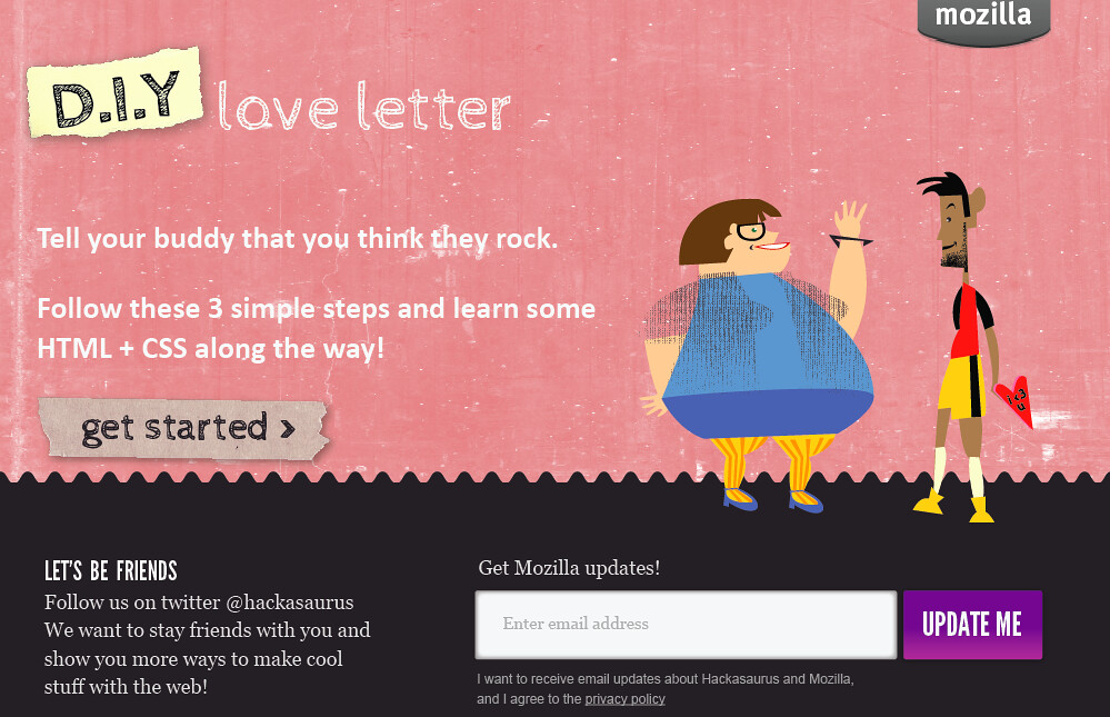
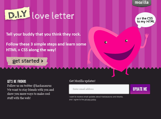
1. A DIY love letter


d.i.y love letter 
version 1

version 2

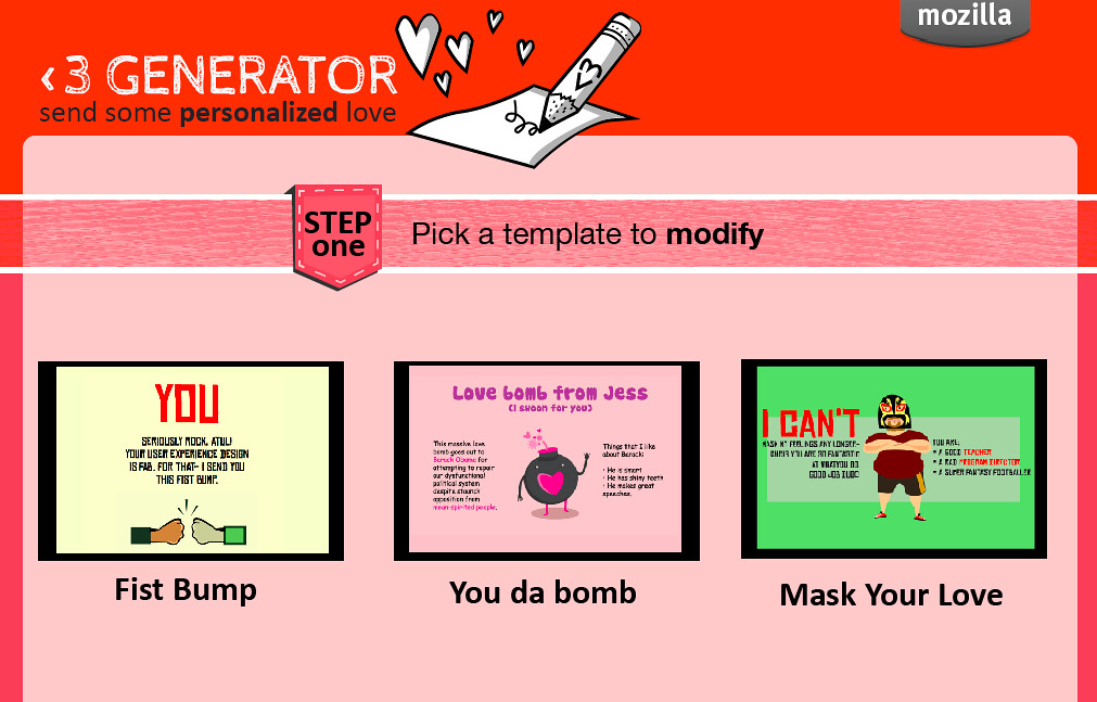
2. A Love Generator- kind of the closest to an e- card maker


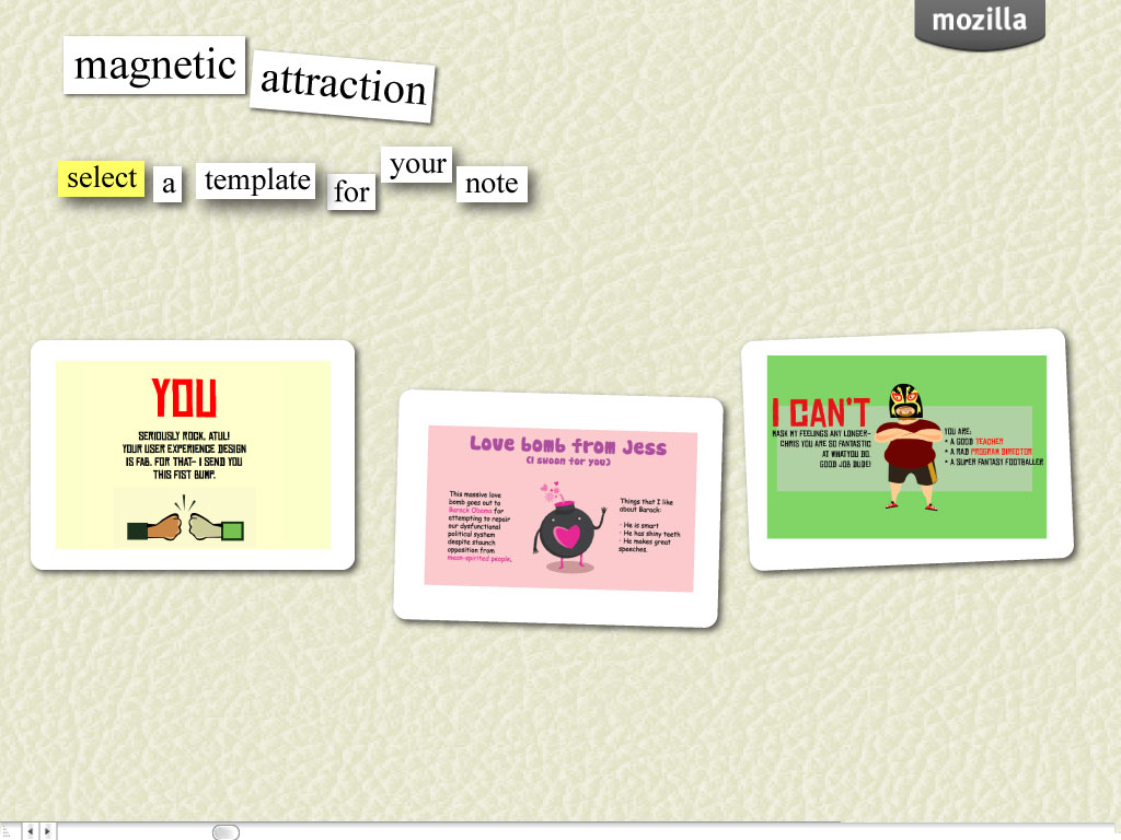
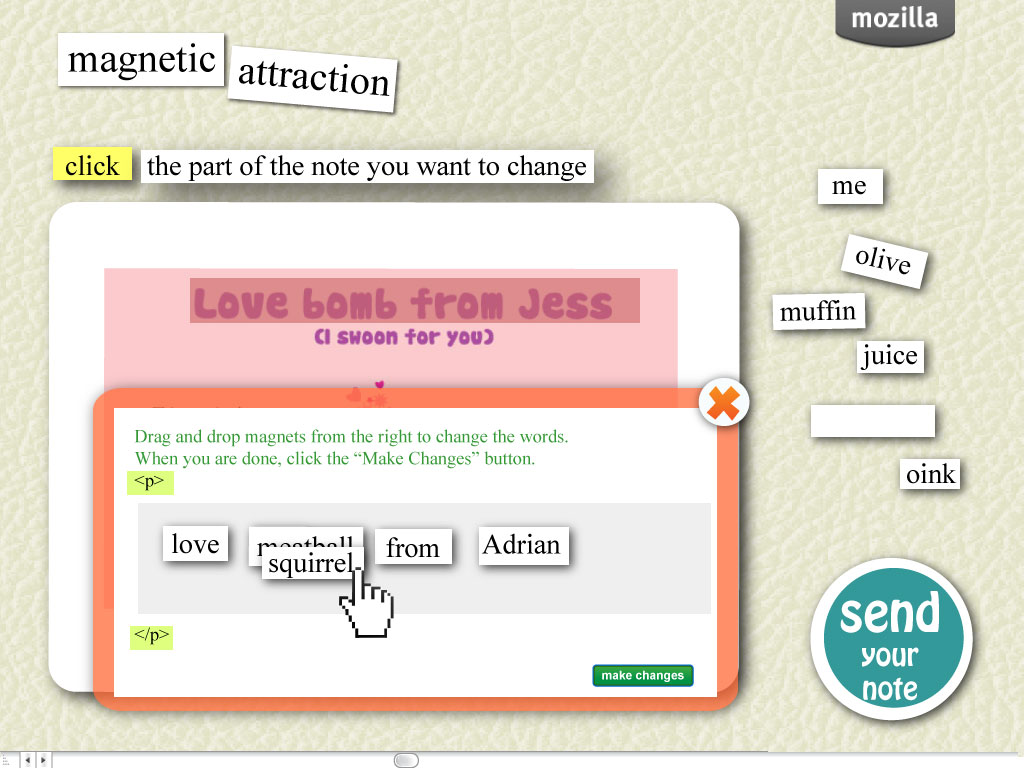
3. Magnetic Attraction- based on the concept of magnetic refrigerator poetry.


Immediately we had a positive response, particularly towards the "Magnetic Attraction" prototype. I showed this to several people in the Mozilla community and did some at - home field testing (re: my mother understood the project). I played a bit with the actual format for the interaction. The concern here was that the current X-Ray Goggles tool and/ or the Web Page Maker prototypes might be too high level for say, the audience who receives the Firefox newsletter. So I went to work trying to focus on how to communicate that something has "html" or "css" underneath it's hood. 


 step 1: select a template

step 2: select an asset on the template and drag and drop the magnets to remix the html.
As you can see from the mockup, I really limited where you can click with your mouse.

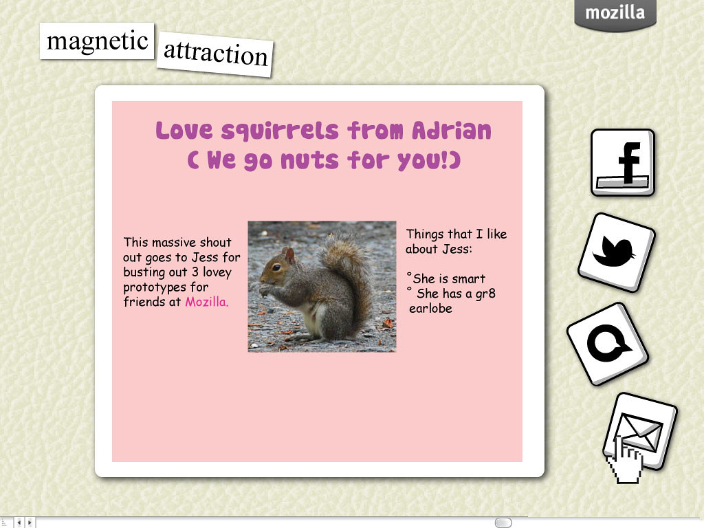
 step 3: voila. share through social network buttons
Looks good, right? Sure we would need to iterate on this, but this is a workable prototype.

Not so much- the problem that I am having with this, is that although it is accessible, and people who have some innate fear of html will be able to really just dive in- ultimately, they aren't tinkering or experimenting with a markup language. At the end of the day, a user is really just editing fields, as if this was a form. I suppose that if someone hovers over a
tag, then an explanation could pop up linking to some database like the MDN which could explain what that little strange object on a page means. But, I think that our goal at Mozilla is not to hide code, or to break it down to a level that is so obscure that you aren't even given the opportunity to experiment. That said, I'm not really sure where the starting point is at the moment.


My colleague Michelle Levesque, is working on figuring out appropriate "Web Literacy Skills" for Mozilla to support and develop around. The very first category of skills that she writes about is "Exploring". I think that this really hits the nail on the head in terms of why this prototype might not be worth pursuing- we are limiting exploration by curating what elements can be edited and how a user should try to edit them.

Of course, I am flip flopping on this topic and keep thinking about how we need certain parameters so that a learner can feel like they have learned something, even if it is a very small skill in the big picture that is webmaking.


Friday, January 20, 2012

Designing a Badge System


If you had to come up with a system to formally recognize the work that you do, what would it look like? In a nutshell, that is what a bunch of my colleagues and I were tinkering with at the recent Mozilla Foundation All Hands meeting. We were exploring this idea because Mozilla is committed to developing  the Open Badges Infrastructure- a tool that could act as a platform where you can give and receive "badges" or achievements for various kinds of skills- both hard and soft. In addition to that, Mozilla is also going to be acting as a badge issuer within this context.

Over a year ago, I blogged about how I felt conflicted about badges- stating that they were formalizing something informal and sucking the fun out of everything. My thinking around badges has really started to change. Part of the reason for this is that I actually understand what the goals of the project are and have started to truly be inspired by the huge potential for this kind of rethinking of accreditation systems.
badge1
(this is a random badge that I drew) 

Truly, think about yourself as a teenager- or not even- think about yourself as a 30 something, who is stuck at work doing one job, but dreaming of doing another. You can't afford to take off and go to graduate school, so you take classes online, and participate in some online interest specific communities. Over time you have a real skillset, portfolio and community of peers- however- no way of really showing potential employers that you are not just ready for a new job - but qualified and have EXPERIENCE. Enter badges. If you had received a badge for all of your involvement in the various communities- something that a potential employer would recognize and acknowledge, you would be getting that job and rolling up your sleeves!

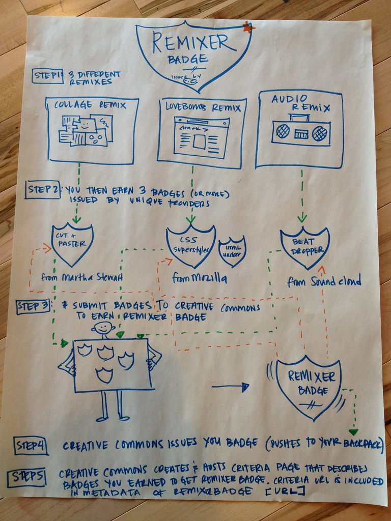
In our prototype (above) we envisioned a system- where one can get a "Mozilla Remixer badge" by getting several lower level badges at different sites where they remixed things- a cut and paster badge from Martha Stewart online- for collaging, a CSS superstyler from Hackasaurus for changing the code on a site, and a beat dropper from SoundCloud for making music mashups. I wrote all the steps out above, but what's fun about this prototype is that the badge itself evokes the spirit of the achievement. You are proving you are a Remixer, by mixing up different orgs who all help you to remix. Yes, that sounded like something Dr. Seuss would say. Obviously, there is a lot of thought on this already out there in the world. But, as a designer, I don't really get something until I try to figure it out in connection with a problem. So here, we had a problem and we came up with a prototype to fix it.


Anyway, my ideas on this are constantly evolving, but I think that's part of the process of really getting something right- getting a lot of things wrong. Hey, I deserve a badge for that, or do I?

Thursday, January 19, 2012

Infusing the Web with Play

Last week, the Mozilla Foundation crew held an All Hands. For the uninitiated, an All Hands is where everyone from the whole organization gets together and does mini design sprints on different topics and projects. This is super important for us at Mozilla because it gives our teams- who often are all over various parts of the world working remotely, a chance to have some much needed face to face time.

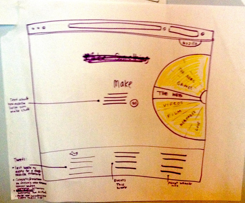
One of our sessions was focused on our potential future website at the Mozilla Foundation. With our new focus this year on really engaging different kinds of webmakers in authentic project based learning experiences, we were asked to envision what the landing page of our new site could look like. My team- which included Dan Sinker and Geoffrey MacDougall did a ton of brainstorming- but ultimately we landed on the idea that a user should be able to immediately come to our site and be able to make something.  Here is a sketch of what we came up with:


The basic concept here is that we offer our user various opportunities to make something with our web properties and tools. The "wheel" which is an homage to a wonder wheel or something that you would see at an amusement park or game show- is actually an interactive filter. I feel that although this might not be the end result, what is nice about this prototype is that it immediately evokes the idea of play or fun.  Sometimes we get so focused in filling our websites with information, that we lose the chance to highlight our core values and voice. I think that our mock up speaks with our voice and although there will be hopefully many iterations and other ideas, I hope that we always keep to our ultimate goal of empowering people to learn something through making something that they are passionate about.

Wednesday, January 4, 2012

On Inspiration and lovebombs

Mari Moreshead is awesome. She works at the Mozilla Foundation as the grease (wo)man, the person you go to when you need to get things done- and done well. She has personally helped me a whole lot- particularly during this one trip that I had to make while I was in Berlin with the flu, having to present Hackasaurus localization. Having a trustworthy, reliable and sassy co-worker is not only helpful, but it is needed in order to be a successful worker. Atul Varma and I were talking about her and thinking about how we wanted to thank her.
" We should make her an e-card."
" No we should make her an html5 lovebomb"
"Wouldn't it be cool to make a lovebomb maker that uses the Hackasaurus tools?"
"We could send lovebombs to all our co-workers who do small great things"
And so, we made lovebomb.me It started out as a simple sketch- and turned into this experiment in love and code. The idea is that you can send someone a lovebomb- or love note/ nod of appreciation and while you are doing it, you learn a little bit of html and css along the way. Here is one of the first mockups I made....


What was kind of fun and happenstance- was that I was running a bunch of workshops for teenagers at the exact time that we were tinkering with the idea. Atul had whipped up a prototype of what we are calling the Webpage Maker- a tool that will help users go from hackers to webmakers. I tested that tool with youth- and while iterating on both tools at the same time, somehow the two combined and became the current version of the lovebomb.


Designing the lovebomb has been a lot of fun for me- and it's rewarding because people immediately pick it up and want to just express joy or love or something happy. People smile using the tool.

I created a few templates, but I want to talk about one of them. It features a character, loosely - ahem- based on my colleague Chris Lawrence. Chris has a love of weird hats, masks and accessories in general (think- viking hats and gold sunglasses). I made this e-card in his honor, because he is another colleague of mine at Mozilla who is doing amazing work every single day. He isn't just working on one project - but possibly 30 at any given time. So, this is my way of giving him some "big ups."
Next steps- well Atul and I are working on a more polished iteration of the lovebombs - I hope to post some of my mock ups in the next few days. I see that this is a great opportunity to teach someone something because there is ultimately a huge DESIRE to make the end product. So I am trying to build out the mock ups and keep true to some of the core learning objectives for Hackasaurus. But at the end of the day, it comes down to this: when you are inspired - you will make things that are challenging and difficult to make-despite yourself. I am just lucky enough to have amazingly inspiring co-workers surrounding me.

Oh and Mari- here is your lovebomb.